Challenge 1 - Budgetzilla W1
Day 1: From Blank Page to Blueprint
Every app starts with a name and a vision. Day 1 was all about laying the foundation — making the key decisions that would shape everything to come.
What I worked on:
Naming the app — Finding a name that captured the purpose and feel of the product.
Defining the first screens — I focused on two core views:
Dashboard — a bird's-eye view of the user's finances at a glance.
Expense detail page — where users can dig into individual transactions.
Typography — Establishing the visual language of the app, choosing fonts that would set the tone for the entire product.
Choosing the tools — After weighing my options, I landed on:
Lovable for AI-assisted development.
Figma for design.
With the blueprint in place, it was time to start building.
Day 2: Refining the Look and Expanding the App
With the foundation in place, Day 2 was all about polishing the visual identity and growing the app's functionality. Because apparently one day of decisions wasn't enough.
What I worked on:
Color palette update — Revisited and refreshed the UI with a new color scheme to better reflect the app's look and feel.
Typography adjustments — Fine-tuned the font choices and text styling established on Day 1 for better consistency and readability.
Main card redesign — Reworked the central card component to improve its visual hierarchy and overall impact.
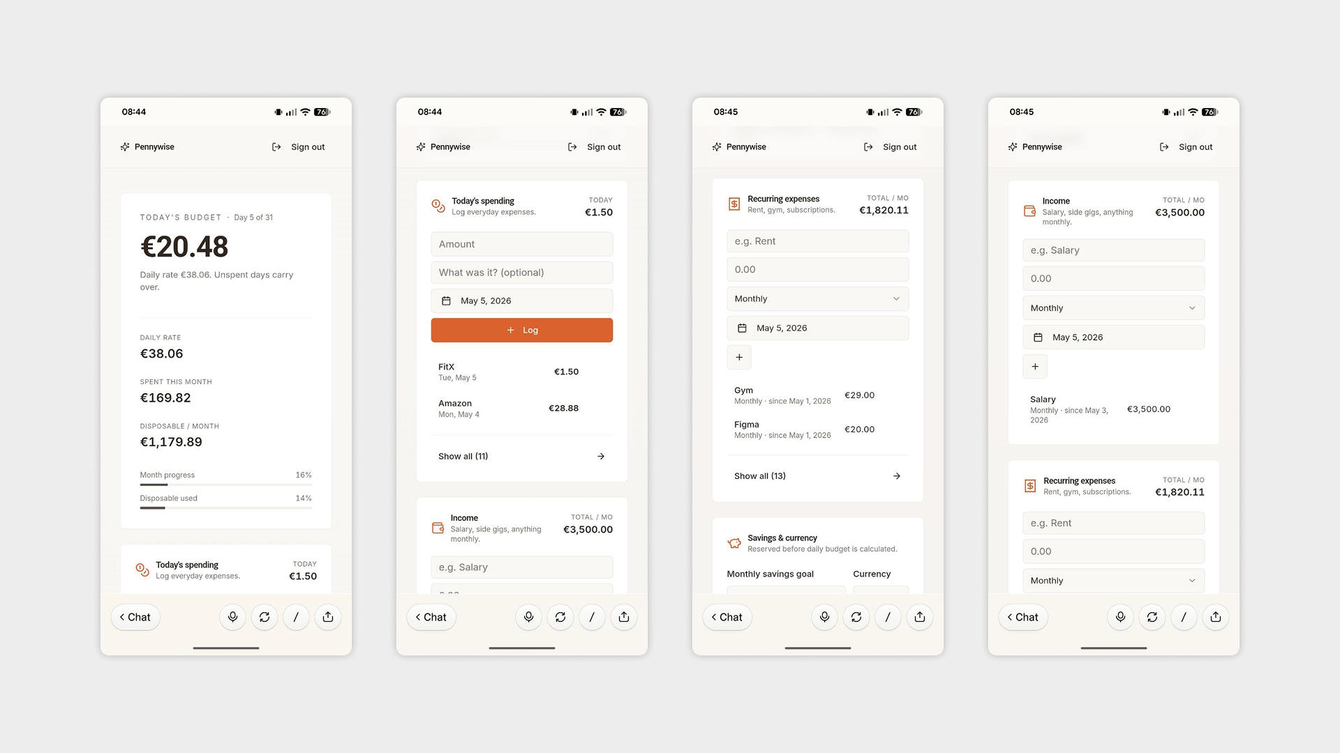
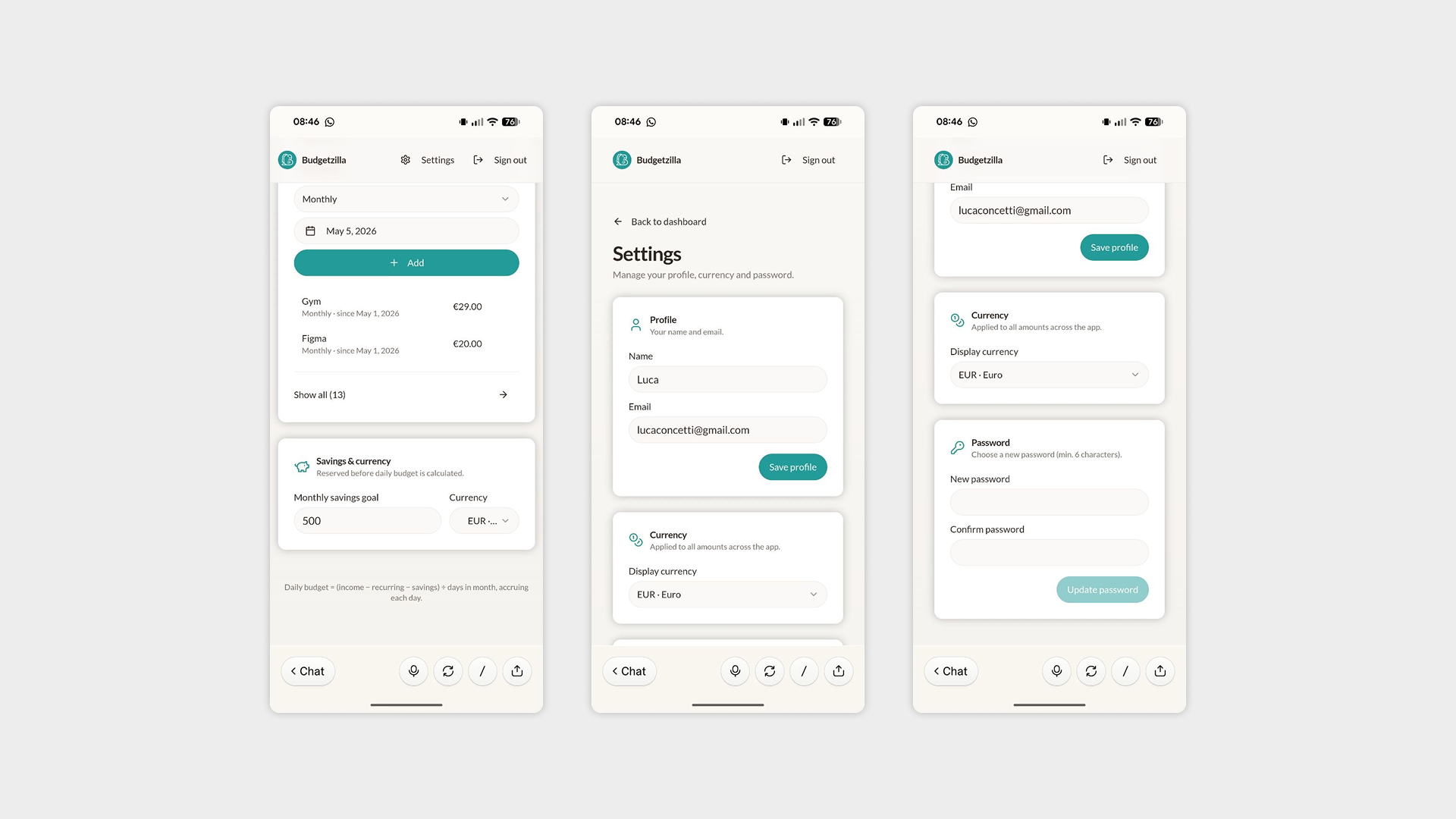
Settings page — Added a dedicated settings screen, giving users control over key preferences:
Change currency — allowing users to switch to their local or preferred currency.
Change password — for account security management.
Change name — so users can personalize their profile.
With the UI feeling more cohesive and the app growing in scope, the product was starting to take real shape.
Day 3: A Major Structural Overhaul
Day 3 was the heaviest session yet — touching almost every corner of the app, from fine-grained visual tweaks to significant structural changes in how users navigate the product. A light Tuesday, really.
What I worked on:
General UI refinements — A thorough pass across the app adjusting padding, colors, and typography to bring everything into tighter visual harmony.
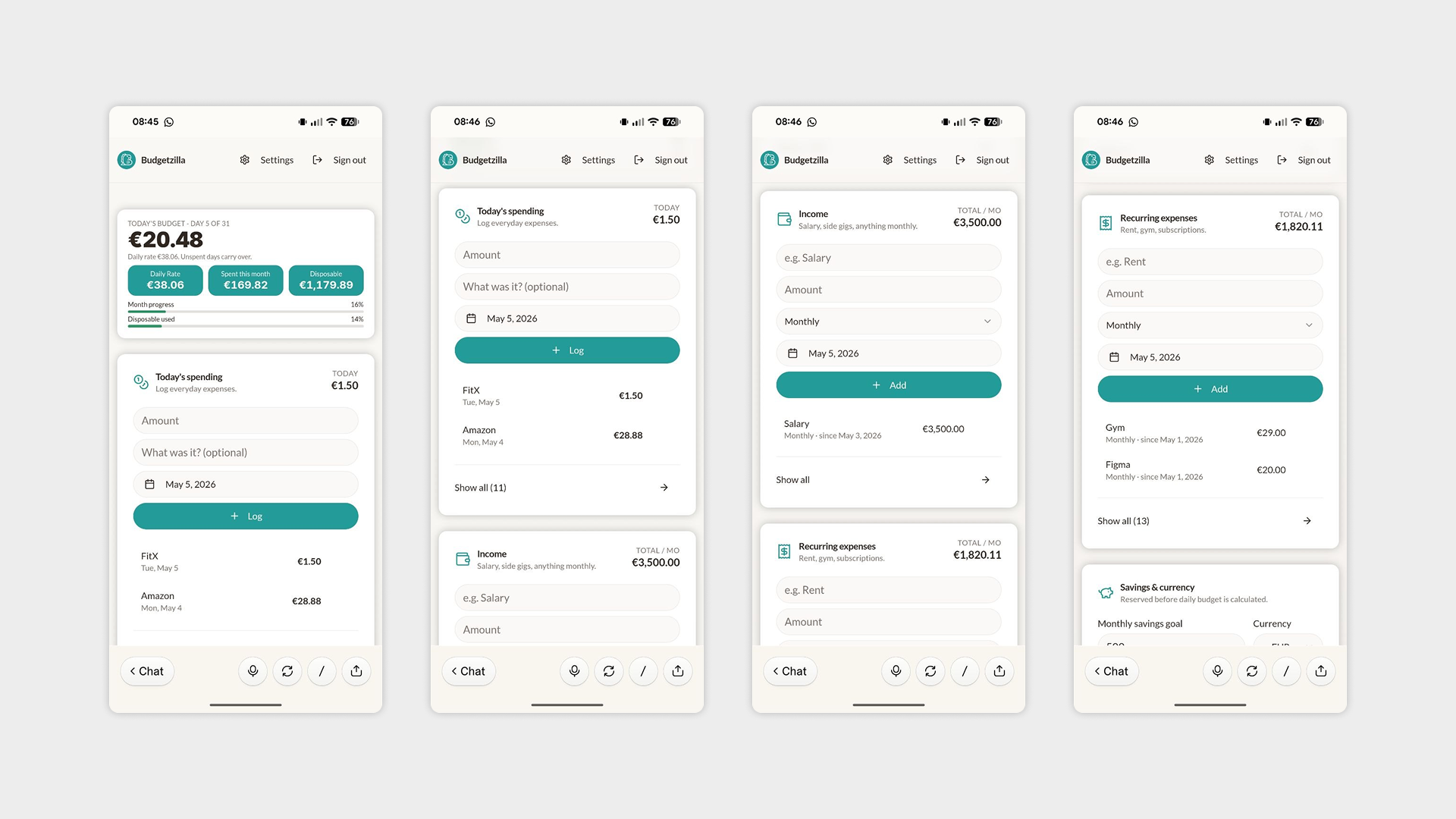
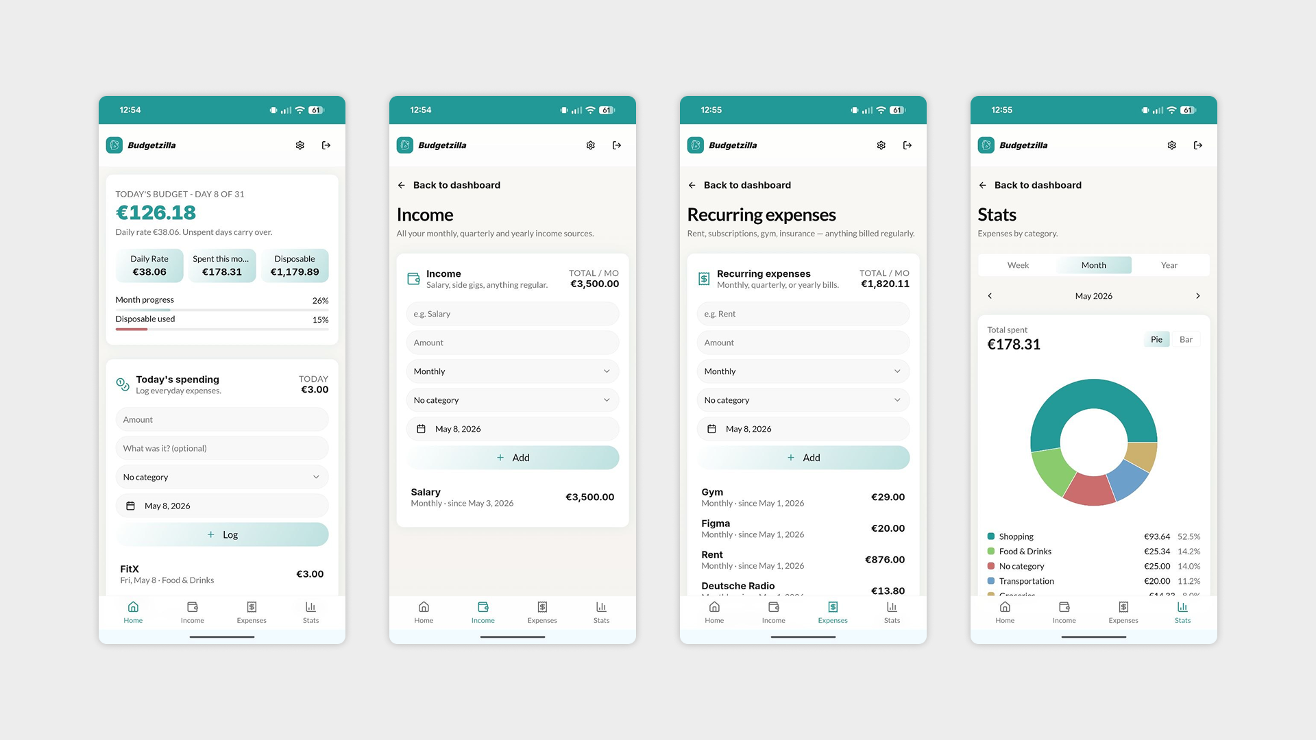
Bottom navigation bar — Introduced a bottom nav to break up what were becoming very long, scrollable pages. The app now has four dedicated sections:
Dashboard — the home overview.
Income — tracking money coming in.
Expenses — a dedicated view for spending.
Stats — added as a placeholder for future data visualizations, currently blank. It'll be fine.
Header restructure — Moved Settings and Logout into the header to keep the main navigation clean and focused.
Swipe gestures for expenses — Replaced the standard tap interaction with a swipe gesture on expense items, revealing Edit and Delete actions. A cleaner, more intuitive experience that keeps the UI uncluttered. Deleting an expense also now triggers a confirmation screen to prevent accidental removals — because nothing kills trust faster than a missing transaction.
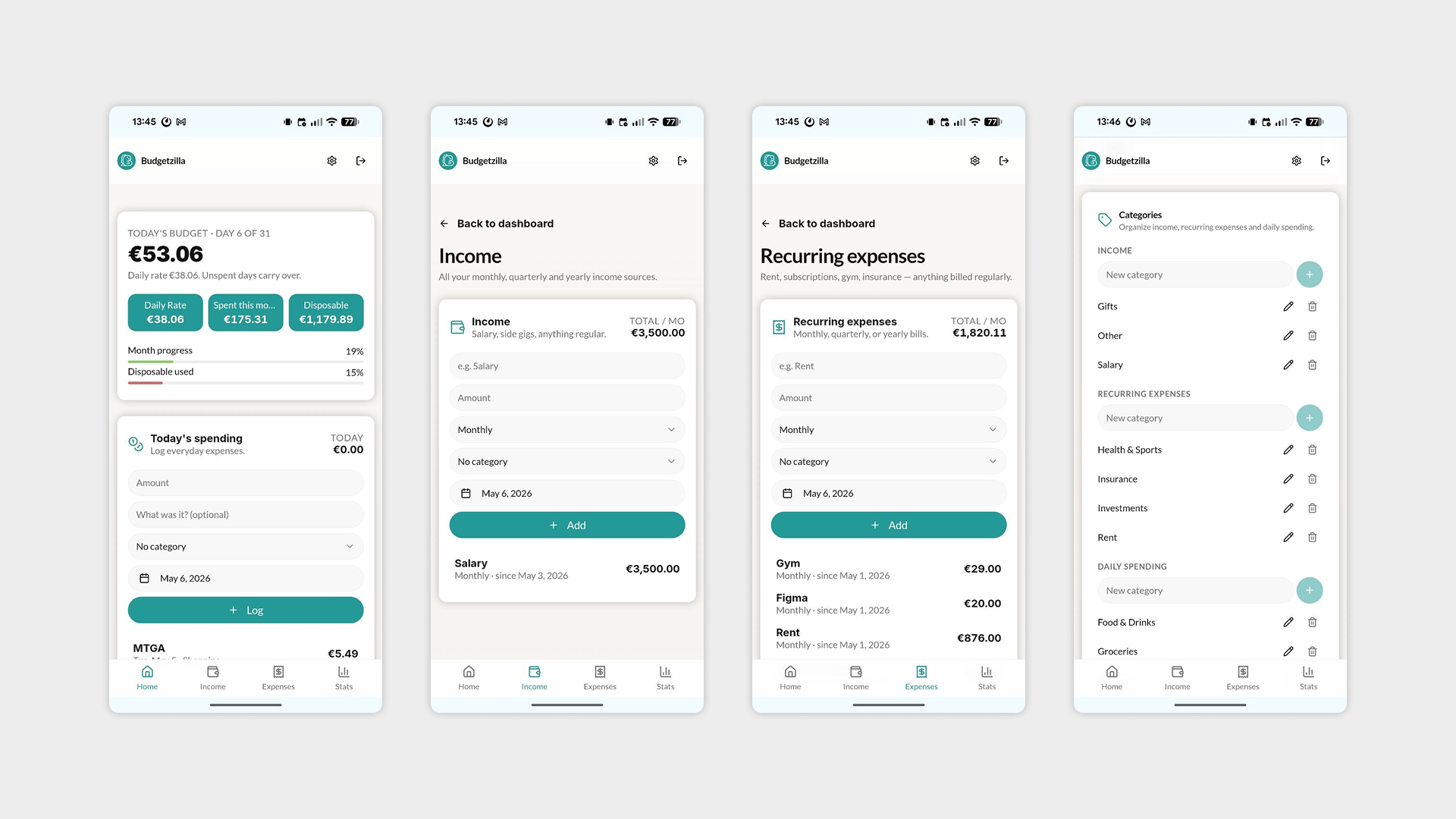
Categories system — One of the bigger additions of the day: a full category management system inside Settings, covering three groups:
Daily spending — categories for everyday expenses.
Income — categories for different income sources.
Recurring expenses — for fixed, repeating costs like subscriptions or rent.
Each category group is displayed separately and is fully editable by the user directly from the Settings page.
Day 3 marked a turning point — the app now has a real structure to build on, with clear navigation, intuitive interactions, and a flexible system for organizing financial data.
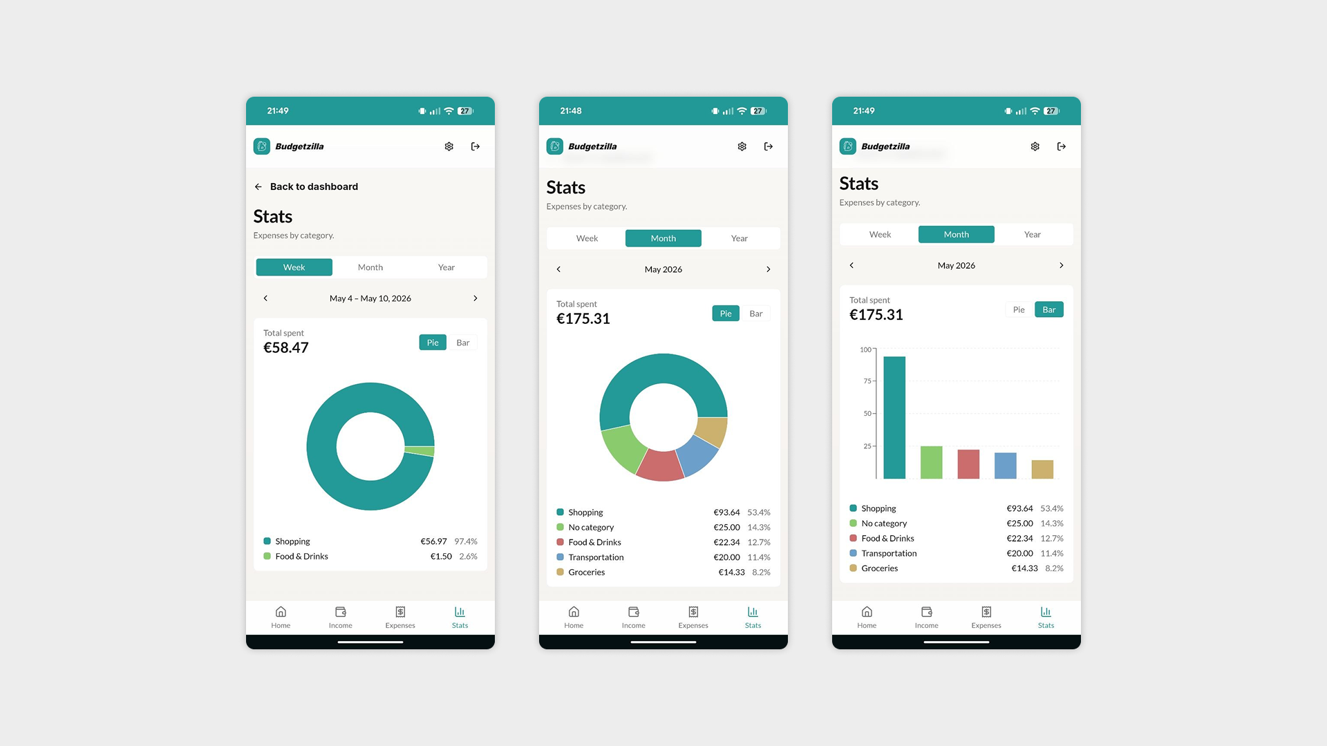
Day 4: Bringing the Stats to Life
Day 4 was dominated by one big feature — turning the blank Stats page into one of the most visually rich sections of the app. One chart became two. Two charts became a full data experience. Nobody is surprised.
What I worked on:
Stats section — The centerpiece of the day. What started as a simple pie chart quickly evolved into something more comprehensive:
Pie chart — the starting point, giving a visual breakdown of spending categories.
Bar chart — added to complement the pie chart and provide a different perspective on the data.
Percentage breakdown — each expense category now displays its share of the total, making it easy to spot where money is going at a glance.
Time switcher — a toggle allowing users to filter the stats view by week, month, or year.
Responsive navigation — Moved the menu to the top navigation bar on desktop and tablet, adapting the layout to larger screens where a bottom nav makes less sense.
Favicon update — Fine-tuned the favicon to display as a full bleed icon on both iOS and Android, ensuring the app looks polished when saved to a home screen.
General UI adjustments — The usual round of small refinements to keep everything consistent and tight.
Day 4 was a reminder that features rarely stay simple — what begins as one chart can quickly grow into a full data experience. Scope creep: alive and well.
Day 5: Polishing the Palette
A shorter session after the intensity of Day 4. Day 5 was dedicated entirely to refining the app's color palette — revisiting the UI with fresh eyes and making targeted adjustments to ensure consistency, contrast, and visual cohesion across all screens.
Sometimes the most important work is the quietest.
Day 6: The Final Push Before Launch
Day 6 was about getting the app ready for its first real audience — a group of friends who would put it through its paces and provide early feedback. Nothing like shipping to people you know to keep the quality bar high.
What I worked on:
UI consistency pass — A final sweep to iron out any remaining visual inconsistencies across screens, ensuring the app felt polished end to end.
Terms & Cookies policy — Added the necessary legal groundwork, an important step given that the app stores user data. The least glamorous part of the whole project, and somehow still necessary.
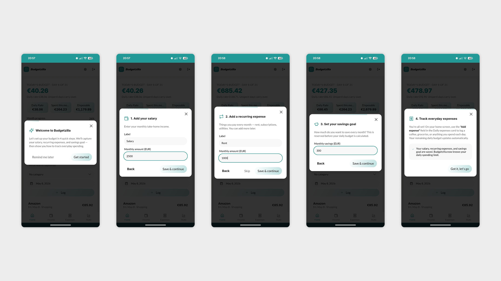
Onboarding tutorial — Designed a small guided tutorial to help new users hit the ground running. A key UX decision was made around how it behaves:
The tutorial can be skipped up to 5 times — after that, it disappears permanently, so it never becomes a nuisance for returning users.
For my account only, a hidden trigger in Settings allows me to relaunch the tutorial at any time, useful for design reviews and testing without affecting the experience for real users.
With that, the first version of the app was ready to go out into the world — imperfect, but solid enough to learn from. Six days, one app, and a lot of second-guessing color palettes. The real work was about to begin.