Design Process
In this section I would like to show my approach to design. Starting from a task or goal set by a project manager or other stakeholder I would like to show you step by step my work process.
The project I am showing you here is from a design challenge I received during an interview in the past.
Explore the website on a mobile device and find a part that you feel can be improved, modified, or completely removed to improve the user experience.
Context: A savings-savvy person in France is looking to purchase a pair of Converse trainers and they’d like to save money on their purchase. They search for discount codes on Converse trainers on their mobile devices and come across this Radins link.
Jump to section
Observe
In order to be able to understand the main issues of the product my first step is to observe the main user flow and general user experience.
Identify
After observation I am then able to identify friction points whether they be UI or UX related.
Prioritize
After listing all friction points I identified it is time to prioritize them for the design phase.
Act
The design phase is the “hands on the field” part for which all the previous phases created a solid background.
Phase 1: Observe
This phase consists simply in getting awareness on how the the product is working and which are the main flows the user can follow.

Phase 2: Identify
After looking at the user flow and the screens I start to write a list of the most prominent friction points on which I want to focus my design/redesign phase.
I group them into two clusters: one for layout changes and one for missing features.
Layout
Font size too small (for older audience)
Labels/categories not clear
The main code is out of the reachable thumb area
Lack of consistency in 2nd navigation icons (burger/search)
Features
How can I find the best deals?
Can't copy the code directly from the first screen
Phase 3: Priotize (Idea 1)
Copy the code directly from the first screen.

Why prioritize this?
Reduction of the "time to goal" where the goal is copy the code and use it in the cart.
Creation of a more "native interaction" between Radins and the seller website
Phase 4: Act
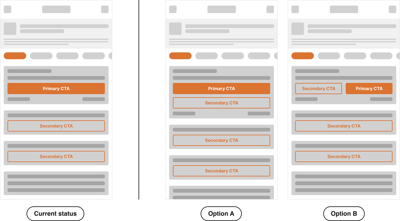
Initial Options
Accessibility
This heatmap shows thumb zones: green = easy reach, yellow = moderate, red = hard.
In Option A, the primary CTA sits in the most comfortable area, making it more accessible for one-handed use. In Option B, it’s shifted to the right, which may work better for some users but is less inclusive overall.
For accessibility, place key actions where they are easiest to tap, ensure buttons have enough space around them, and use clear, legible font sizes that support readability. These practices improve comfort, reduce errors, and create a more inclusive experience.

Visibility
In Option A, the primary CTA appears higher on the screen, making it visible sooner and easier to access without scrolling.
Secondary CTAs follow in a clear hierarchy, creating a predictable flow. In Option B, the primary CTA competes with a secondary one at the top, and other actions are pushed further down, increasing the chance they’re overlooked.
Ensuring primary actions remain visible, supported by clear order, spacing, and legible text, helps users find and act on key items quickly and confidently.

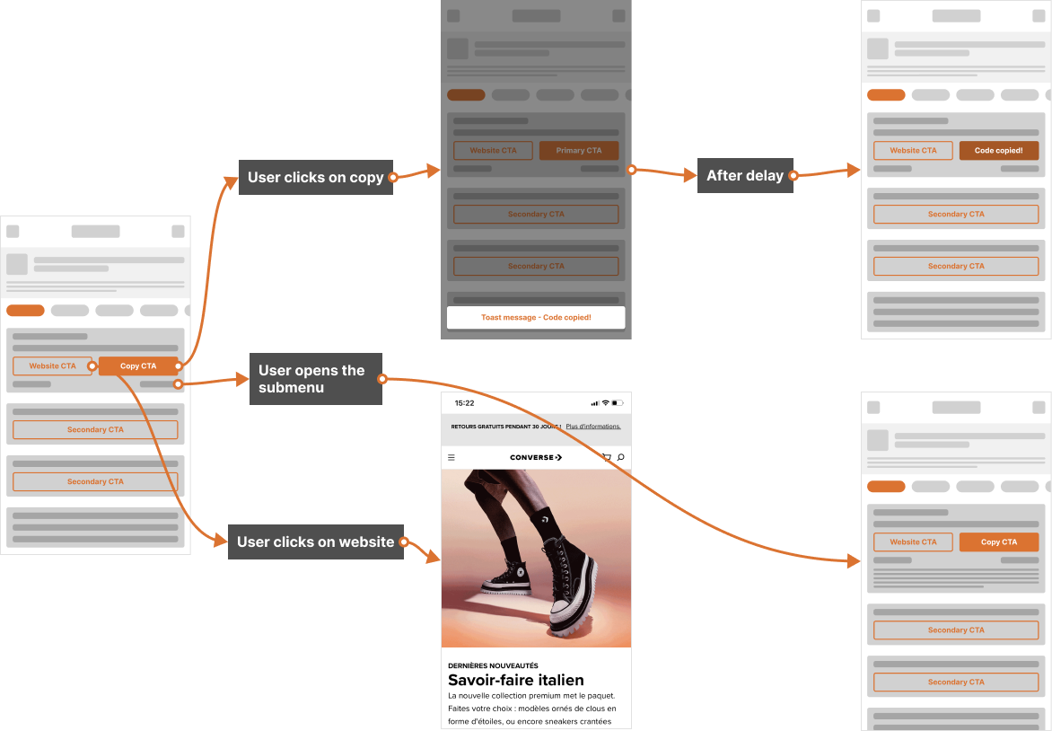
New flow
This flow highlights the importance of feedback and clarity in interactions. When the user clicks on “Copy,” an immediate confirmation (toast message) reassures them that the action was successful.
After a short delay, the interface updates to reflect the copied state, reinforcing the feedback. Similarly, when navigating through the submenu or opening the website, clear transitions guide the user smoothly without confusion.
Consistent status updates, visible states, and intuitive navigation reduce uncertainty and help users stay in control of their actions, creating a more seamless and trustworthy experience.
Testing
To test the new layout of the page the success metrics I take in consideration are:
Time to Goal. The goal is “copy the code and leave the website”
Cart Abandonment Rate. Since time is a fundamental part during an online transaction, reducing the number of pages to load and interactions for the user should reduce the Cart Abandonment Rate.
For the Time to Goal test some user interviews should be conducted to measure the time users use to copy the code. For the Cart Abandonment Rate an A/B test should be conducted.
