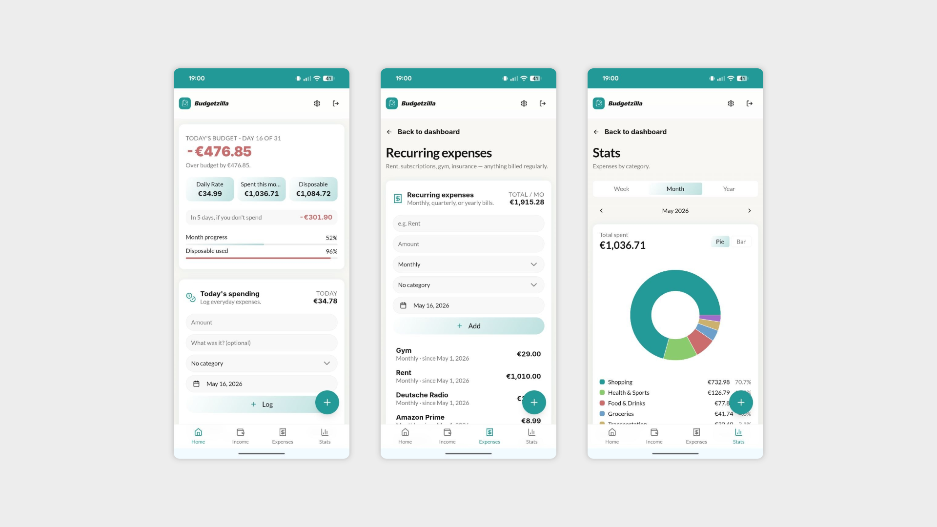
Budgetzilla - Week 2
Days 7–8: Interviews, Feedback & Small Wins
The first week was all about building. Week 2 opened with a shift in focus — reaching out to potential users and starting to organise interviews to gather real feedback. Because at some point you have to stop talking to yourself and hear what actual people think.
That said, waiting for calendar invites to be accepted leaves plenty of time to keep tinkering. A few small but satisfying improvements made it into the app:
Haptic feedback — Added tactile feedback when logging an expense. A small touch, but the kind that makes an app feel alive rather than just functional.
5-day spending projection — A new feature that estimates spending for the next 5 days based on existing data, giving users a glimpse into where their finances are heading.
Toast notifications — A confirmation message now appears when an expense is successfully added, closing the feedback loop for the user.
Swipe gesture removed on desktop and tablet — The swipe-to-edit interaction made sense on mobile, but had no place on larger screens. Cleaned up and removed.
Not the heaviest two days, but proof that good products are built in the margins too — between the meetings, the waiting, and the slow work of getting people in a room.
Day 9: First 2 interviews
Interview #1
The first user jumped in relatively easily, skipped the tutorial and still managed to navigate the core flows independently: logging expenses, income, and one-time expenses without hand-holding.
What went well:
Found and added categories with minimal friction, around 20 seconds of exploration before locating them, which is acceptable.
She would like to have pre-built categories out of the box, noting that most common ones are usually the same across users.
The overall flow for adding expenses and income felt intuitive.
What she’d love to see:
Recurring expenses with purpose — The ability to categorise recurring expenses and then evaluate whether each one is actually worth keeping. Less bookkeeping, more conscious spending.
Category spending limits — Set a monthly cap on specific categories and get a heads-up when approaching or exceeding it.
Rollover savings — Any money saved beyond the budget in a given month should carry over to the next. Simple idea, powerful habit.
Sub-categories — An optional layer of granularity (ON/OFF) for users who want to go deeper without forcing complexity on everyone.
Shared one-time expenses — The ability to split or flag one-time costs as shared with someone else.
Add categories on the fly — Rather than navigating to Settings every time, users want to create a new category directly from the expense entry screen.
The magic wand questions:
Automatic bank account sync — The holy grail of every finance app. Technically complex, legally sensitive, and the first thing everyone asks for.
Interview #2
The second user tested the app across both mobile and desktop. A different usage profile from the first, but with some clear overlaps that are starting to point toward patterns worth paying attention to.
What went well:
Navigated the core flows without major blockers.
Tested the app in both environments, giving a broader picture of the cross-device experience.
What they'd love to see:
Time-limited recurring expenses — The ability to set a recurring expense with an end date, like a short-term loan or a temporary subscription. Not everything repeats forever.
Category on the fly — Same request as Interview #1. At this point, it's a feature, not a nice-to-have.
Weekly category limits — Similar to the monthly cap idea from the first interview, but with a weekly lens for more granular spending control.
Goal-based saving — A time-limited savings pot for a specific purpose, like putting money aside for a birthday present or a trip. Small, focused, and with a deadline.
Sharing functionality — Interest in splitting or sharing expenses with others, echoing the first interview.
Observations worth noting:
Didn't engage with categories or the stats page at all — a reminder that not every user will explore every feature, and that discoverability matters.
Missed the bottom navigation bar on mobile at first — a small but telling signal that it may need to be more prominent or better introduced during onboarding.
The magic wand questions (again, noted, again, not promised):
Bank account sync — Two for two. At this point it's less a feature request and more a user expectation for any serious finance app.
Offline expense logging — The ability to add expenses without an internet connection, syncing when back online. Technically non-trivial, but a genuinely useful real-world need.
Day 10: Building on Feedback
One of the best feelings in product development is when user feedback translates directly into shipped features the very next day. Day 4 was exactly that.
What changed in the app:
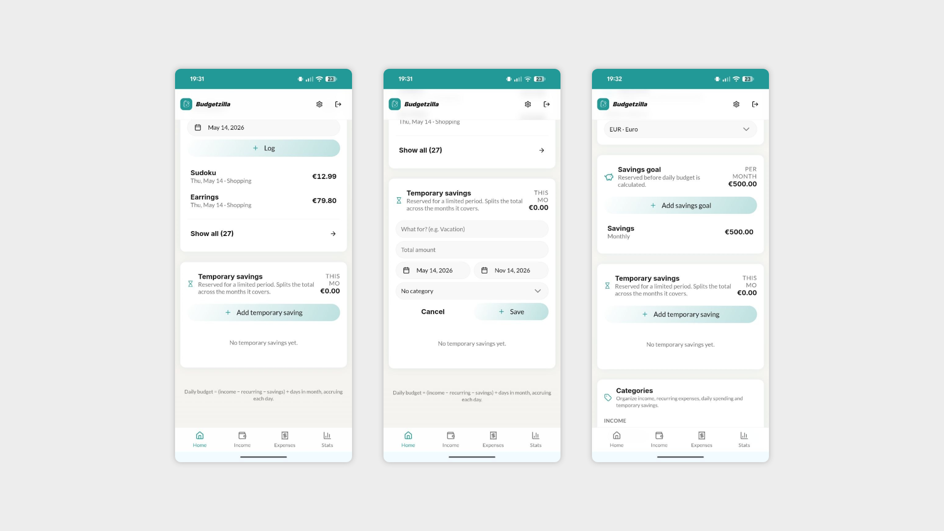
Temporary savings — Added a dedicated savings feature that lets users set aside money for a specific goal over a defined period of time. Heading to a concert, dreading the dentist, planning a holiday? You can now create a saving pot, set a target amount, and give it a deadline. A direct response to the feedback from Interview #2, turned around fast.
Add category on the fly — Users can now create a new category directly from the expense entry screen, without having to detour through Settings. Two interviews, same request, now shipped. Listening works.
Minor UI adjustments — The usual round of small refinements. They add up.
Interview #3
The third interview brought a fresh perspective — and some of the most direct UX feedback so far. No sugarcoating, which is exactly what you want at this stage.
What they flagged:
Expense card not intuitive — It wasn't clear where to tap to interact with it. A fundamental usability issue worth addressing sooner rather than later.
Adding an expense should be the hero action — The primary action on the homepage needs to feel like the primary action. A suggestion to introduce a floating action button to make expense logging immediately accessible from anywhere in the app.
Home screen widget — Would love a widget to glance at the current balance without opening the app. Small lift, big daily utility.
Dark mode — Feels like the UI would benefit from a dark theme. At this point it's less a preference and more a baseline expectation for any modern app.
Category spending alerts — The ability to set a notification threshold on specific categories — for example, getting a nudge when €50, €100, or €200 has been spent in a given category. Smart, proactive, and genuinely useful.
Expense sharing with existing users — Share and split expenses with other people already registered on the app. Third interview to mention some form of sharing — officially a pattern now.
Hard block when limit is reached — Rather than just a warning, the option to fully block further expenses once a category limit has been hit. For users who want rules, not just reminders.
The magic wand questions (three interviews in, same energy):
Payment platform integrations — Automatic syncing with services like Klarna, PayPal, and Satispay. Technically complex, but a clear signal of where user expectations are heading.
Expense sharing with registered users — Noted above, and nudging its way out of the magic wand pile given how often it's coming up.
Day 11: A Quieter Day — Interview #4
A lighter day by design. One interview, one shipped feature, and one more session to go tomorrow before the first interview cycle wraps up.
What changed in the app:
Floating action button — Directly off the back of yesterday's interview feedback, the button is now live. Users can add an expense from anywhere in the app without navigating back to the home screen. Requested on Day 4, shipped on Day 5. That's the pace.
Interview #4
A more measured user profile this time — less interested in social features, more focused on personal financial control. A useful counterbalance to some of the earlier feedback.
What they flagged:
Categories in Settings hard to find — Couldn't locate where to add categories from the Settings page. A discoverability issue that's now showing up across multiple interviews, even after the on-the-fly fix was shipped.
Add category when logging — Same request as interviews #1 and #2, raised independently again. At this point it's less a feature request and more a design mandate — though it's already been shipped, which means the onboarding or UI isn't making it visible enough yet.
"In 5 days if you don't spend" is unclear — The spending projection copy isn't landing. Users understand there's a number, but not what it actually means. A rewording or supporting label is needed.
Progress bar for temporary savings — A visual indicator showing how far along a saving goal is. Obvious in hindsight, and a small change that would make the feature significantly more satisfying to use.
End-of-month target balance — This user typically sets a minimum amount they want to have left in their account at the end of each month. They'd like to define that target in the app and track progress toward it. A slightly different framing of budgeting — not just limiting spending, but protecting a floor.
Category spending alerts — Another vote for notification thresholds on specific categories. The pattern keeps getting stronger.
Not interested in sharing — A good reminder that not every user is the same. Sharing is a clear majority request, but it shouldn't come at the cost of the solo experience.
The magic wand questions:
PDF bank statement upload — Drop in a PDF from your bank and let the app parse and import all transactions automatically. Genuinely clever as a stepping stone toward full bank sync.
Bank account connection — Four interviews, four mentions. Officially the most requested feature in the project.
AI-suggested upcoming expenses — Smart predictions based on spending history, flagging likely future costs before they happen. Ambitious, but the kind of feature that could set the app apart.