Budgetzilla - Week 3
Day 12: Gathering feedbacks
Based on the four interviews, here are the 5 highest-impact features to prioritize ranked by how many users flagged them and how foundational they are to the core experience.
1. Create a category inline while adding an expense: Every single user either struggled to find categories in settings or explicitly asked for this. It's the clearest friction point across all four interviews. Adding a quick "+ New category" option directly inside the expense creation flow removes a context switch that's currently breaking the momentum of logging something. This has already been done during the past week.
2. Category spending limits with alerts: All touched this either as a hard limit, a weekly cap, or a notification threshold. The exact form varies (block vs. notify vs. alert at X€), but the underlying need is identical: tell me when I'm about to overspend in a specific bucket. A single system that lets users set a monthly limit per category, with an optional alert threshold and an optional hard block, would cover all four variants in one feature.
3. Time-bound savings goals: Interview 2 wants to save for a birthday present over a few weeks. Interview 4 wants to set a target balance for end of month. Interview 1 wants to carry over unspent money to the next month. These are three flavours of the same mental model; I'm putting money aside for a specific purpose and a specific deadline. A simple "saving goal" card with a name, target amount, deadline, and progress bar (Alberto specifically called out wanting that bar) would satisfy all three. Also this has been already implemented in the previous week.
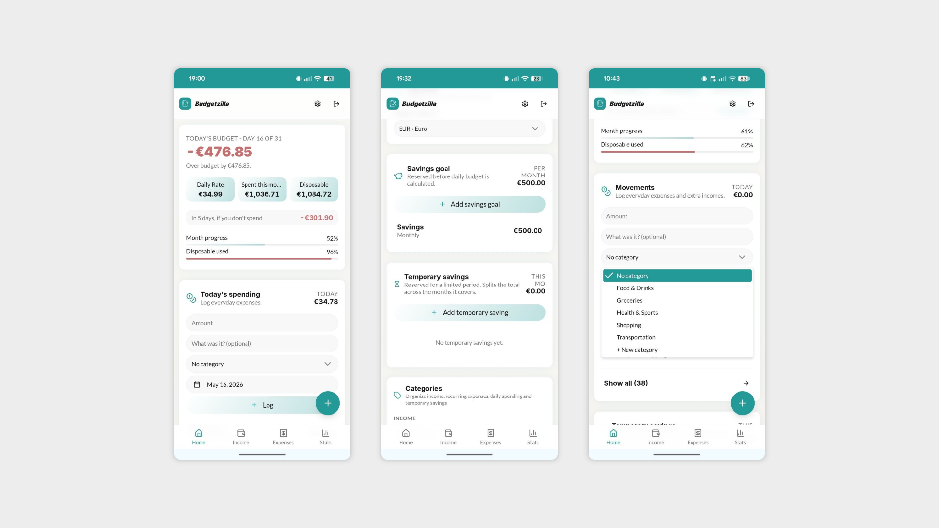
4. Floating action button for adding an expense: Interview 3 called out that adding an expense should be the primary homepage action, and Interview 2 didn't see the bottom nav on mobile at all. This is a navigation/hierarchy issue more than a missing feature a persistent floating action button (FAB) makes the most important action impossible to miss, fixes mobile discoverability, and aligns with the mental model that opening this app = "I just spent money." Already done!
5. Recurring expenses for a limited duration Interview 2 "short loan" use case. A recurring expense that runs for N months and then stops is currently unhandled and distinct from both one-time and indefinite recurring expenses. It's a narrow but very real pattern (subscriptions with end dates, installment payments, a gym trial) that would make the recurring expense model significantly more honest about how money actually works.
Four interviews later, two themes kept coming up loud and clear: people want to feel in control of where their money is going before they overspend, not after — and they want the app to understand that some expenses have an expiry date.
This week I'm building exactly that: category spending limits with alerts, so you can set a threshold and get warned before you blow your food budget on day 12 of the month; and time-bound recurring expenses, for the stuff that's temporary by nature — a short loan, a subscription you're trialling, three installments on something you bought last month. Real money behaviour that most budget apps quietly ignore.
Day 13-14: no credits means do it yourself
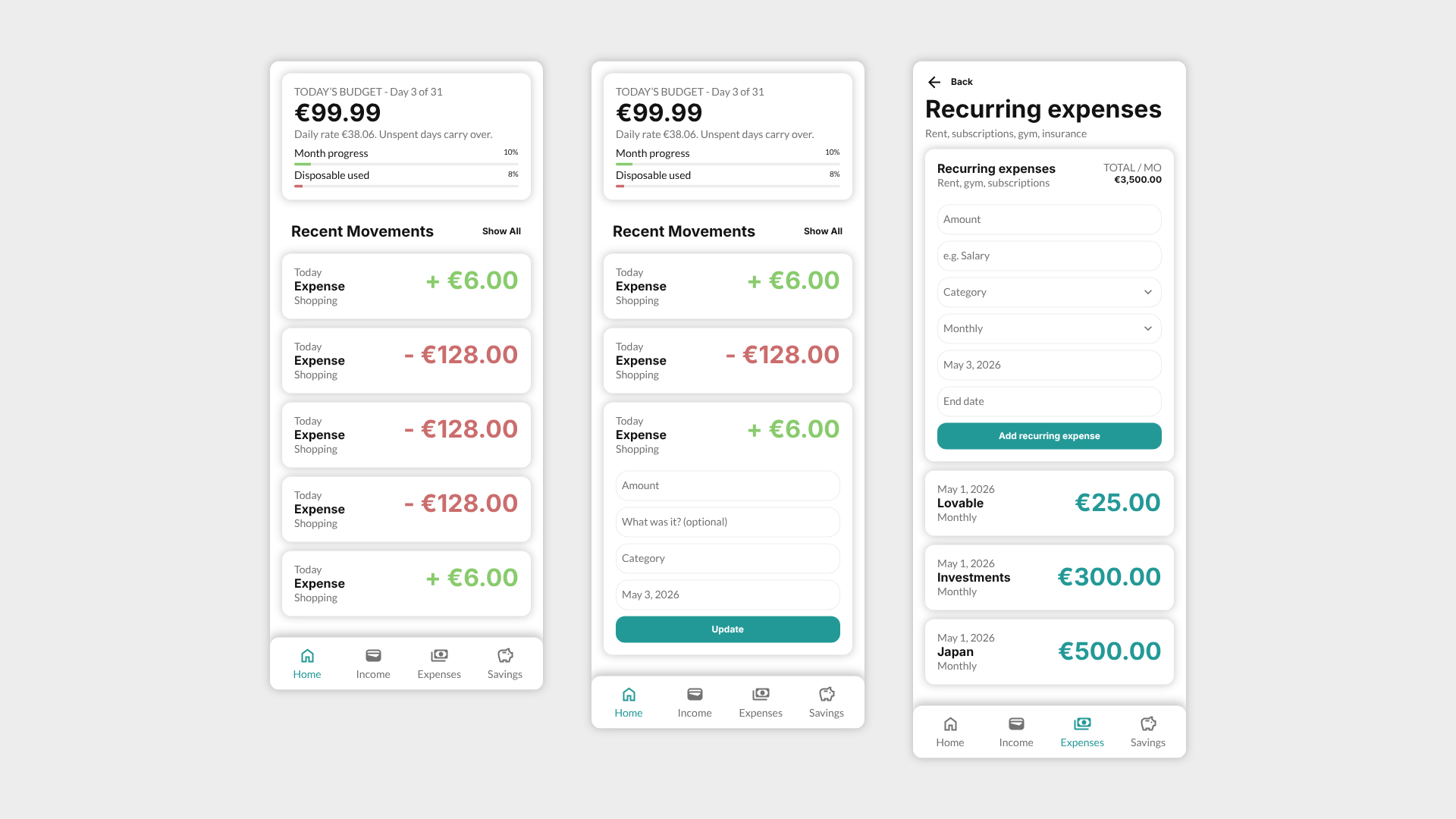
Time-bound recurring expenses are in. You can now add a recurring cost with an end date, so the app actually understands the difference between "Netflix forever" and "three installments on that thing I bought in March."
Then Lovable ran out of credits. So instead of stopping, I took it as a sign.
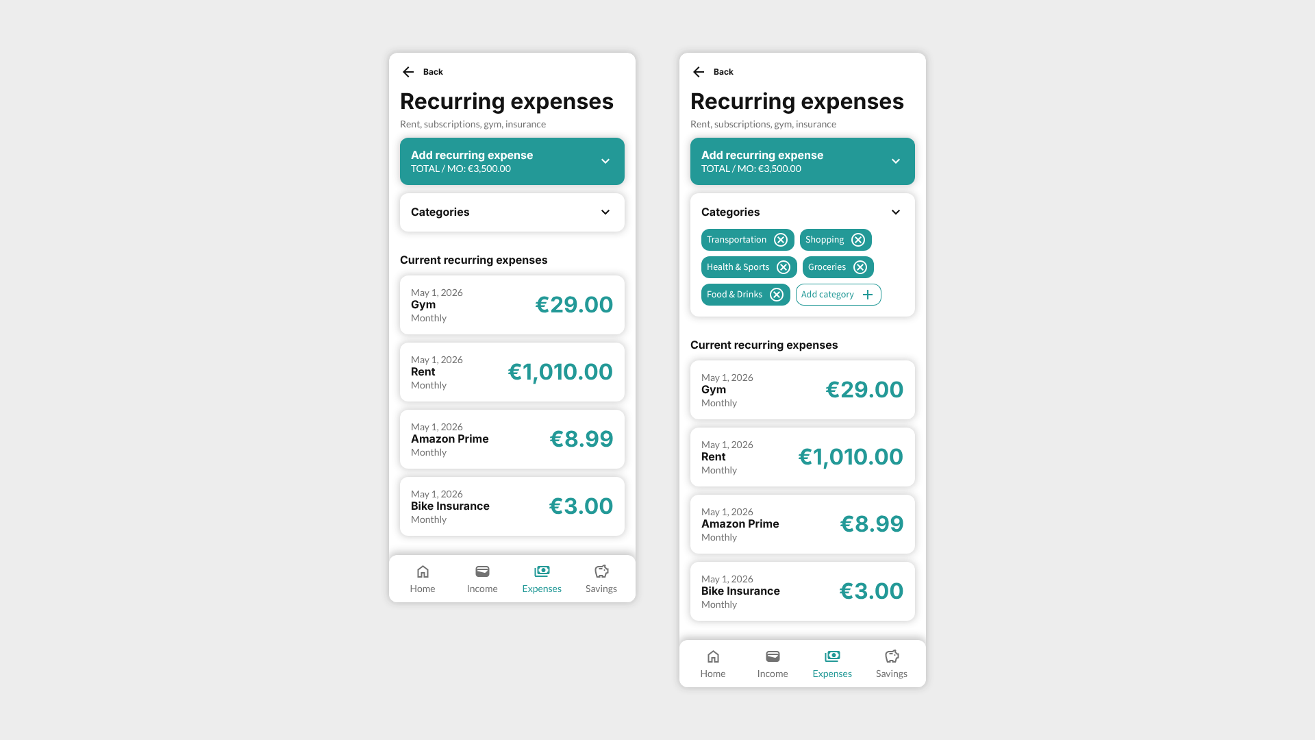
Day 2 and 3 are going into a full UI redesign. Budgetzilla works, but right now it has the visual energy of a spreadsheet that got lost on its way to becoming an app. That changes this week.
The new direction is cleaner, calmer, more intentional. Cards can now breathe, the typography type has a clearer hierarchy and you can finally spot the bottom nav. Small things that add up to an app that feels like it was designed rather than assembled.
The recurring expenses screen also got the treatment. It now shows your time-bound entries in a way that doesn't require you to squint and mentally calculate what's happening.
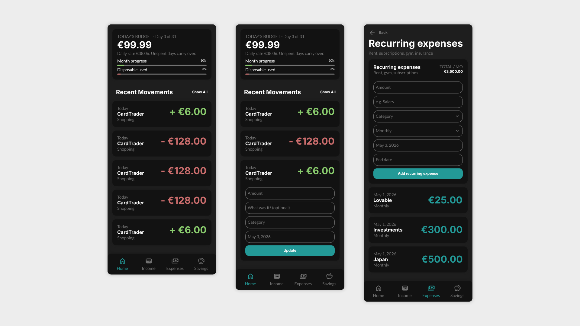
Also shipped dark mode. The idea is that it just reads your device preferences and adapts automatically. In case it won’t be possible then it will live in the settings.
Day 15: bought more Lovable credits. No regrets.
Some of the design changes required the kind of back-and-forth with the AI that eats through a free plan fast. Easier to just pay and keep moving.
Here's what landed today:
The "add income" and "add recurring expense" forms now collapse and expand — so the list stays front and centre instead of getting buried under an open form every time you scroll.
Savings got promoted to the bottom nav. It was living as a second-class citizen before. Not anymore.
Stats got demoted. They're still on the homepage, but I pulled them out of the nav for now. I want to think harder about what "useful stats" actually means for a budget app before I give them prime real estate again. A page full of charts nobody opens is just decoration.
The only thing left before final debugging is the category limits and alerts system — which was one of the two core features this week was supposed to be about. At this rate I might actually finish ahead of schedule.
Day 16: the kind of work that doesn't look like much but fixes everything.
No new features today, just the stuff that makes the app feel like someone actually thought about it.
You can now add a category directly from the income, recurring expenses, and savings pages. No more detour to settings every time you think of a new one. This came straight from the interviews, 4/4 users either struggled with it or asked for it explicitly.
The CTAs got a proper colour treatment too. "Add income", "add recurring expense", "add savings" are now visually primary, which means they look like buttons you're supposed to press rather than suggestions.
And each page finally has actual hierarchy: actions up top, list below. Obvious in hindsight. Surprisingly easy to get wrong the first time.
Day 5 addendum: category limits and alerts are moving to next week.
Not because I ran out of time but this feature is more interesting than I initially scoped it. Spending limits only make sense if the stats around them are useful, and right now I'm still thinking about what "useful stats" looks like in Budgetzilla.
Better to take the extra time and design it properly than to ship a number with a red bar and call it done.