Daily Papers - Week 1
I used to rely on a website to generate my daily journaling prompts. It stopped working. Instead of finding another one, I did the completely proportionate thing and built my own app. Daily Papers is a prompt generator for daily journaling — nothing more, nothing less. No feature creep, no scope expansion, no six-week odyssey. Two weeks, one problem, one solution.
Day 1: Home Screen and the Calendar
The first day was about building what the user actually sees — the two screens that define the whole experience.
What I worked on:
Home screen layout — The first pass at the main interface. Clean, focused, and built around a single purpose: show today's prompt and get out of the way.
Calendar view — A calendar that shows which prompt was generated on any given day. A simple but satisfying way to look back at a journaling streak and see the questions that shaped it over time.
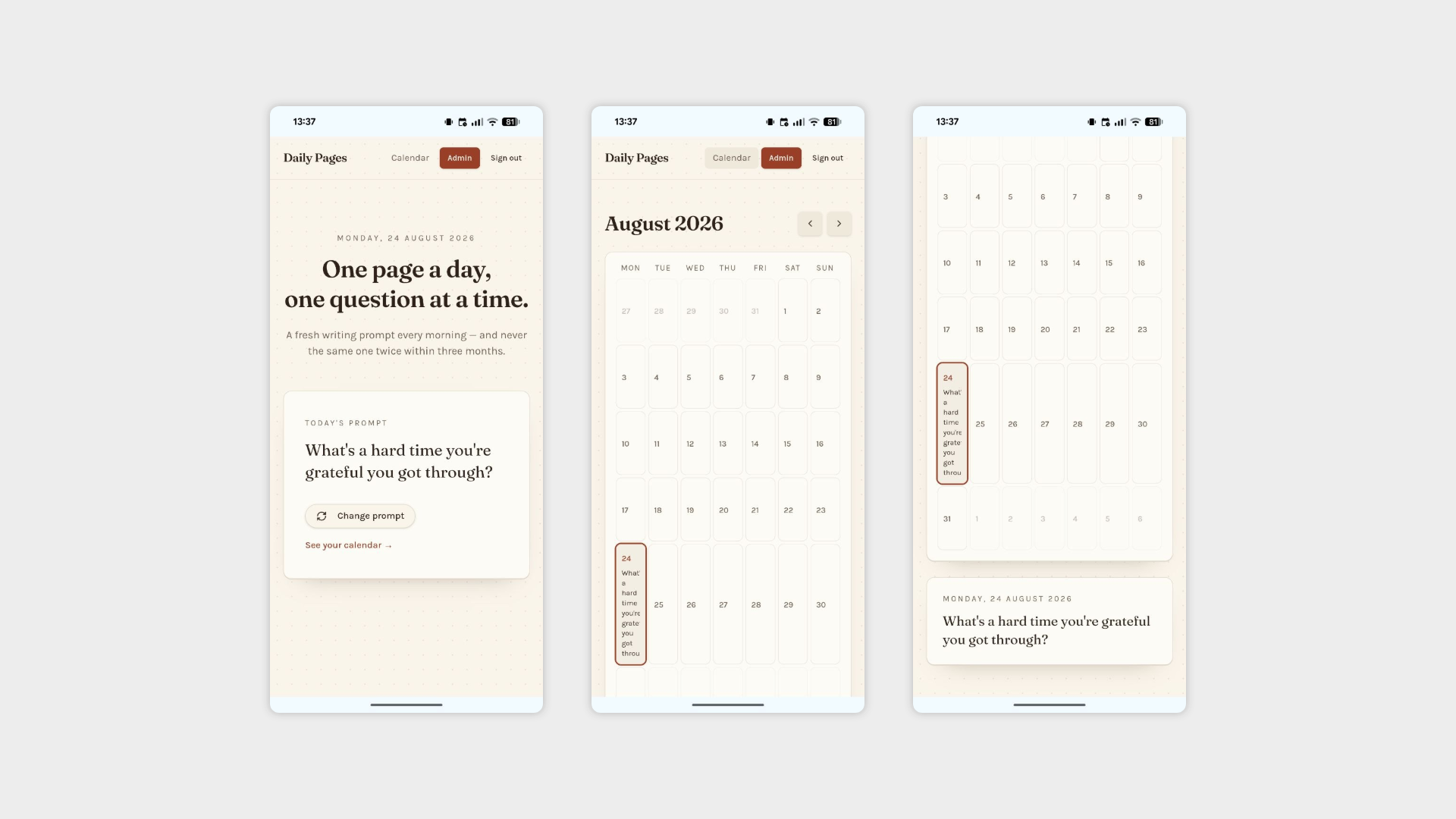
Homepage and Calendar Page
Day 2: The Prompt Engine
With the interface in place, Day 2 went under the hood — building the logic that makes the whole thing actually work.
What I worked on:
Prompt storage engine — Built the underlying system that stores and serves prompts. Rather than overcomplicating it, the solution is deliberately simple: an admin-only text field where all prompts can be pasted in bulk at once. No complex CMS, no database UI, no unnecessary tooling. Paste, save, done.
No-repeat rule — A prompt can't be shown again within a 3-month window. The whole point of a daily prompt is variety — getting the same question you answered in October while it's still January would rather defeat the purpose.
Prompt history awareness — When a new prompt is generated, the app checks whether the user has seen it before and flags it if so. A small touch that makes the app feel like it actually knows you, rather than just rolling the dice every morning.
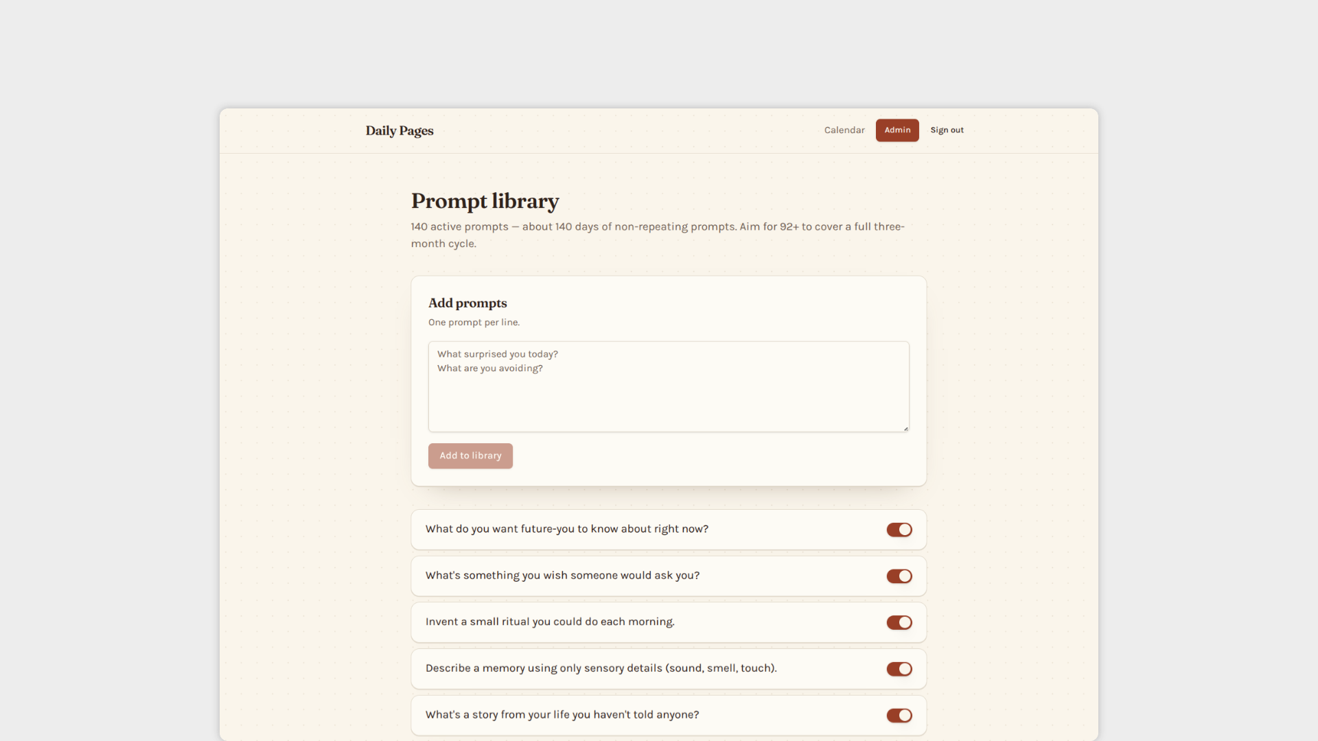
Prompt Admin page (available only for my account)
Day 3: Lights Out
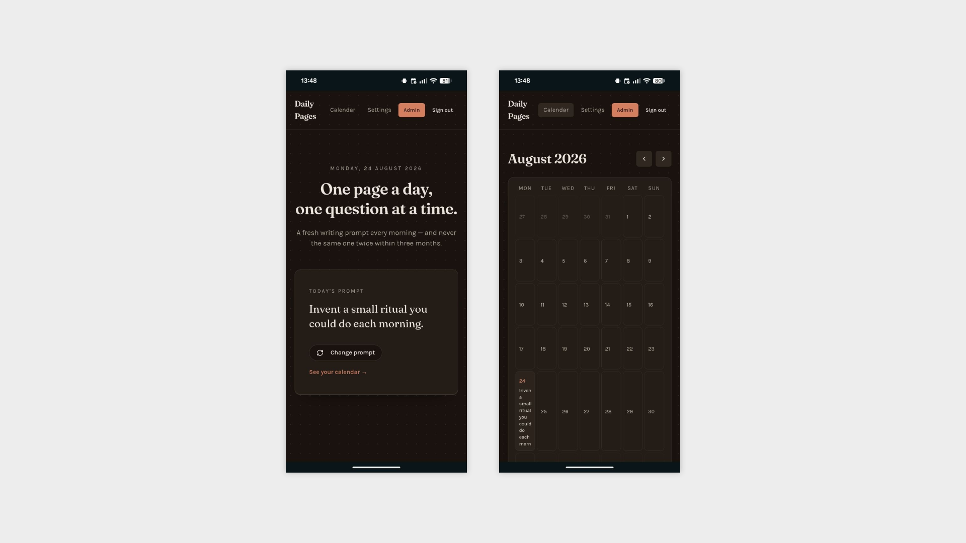
Short day, one feature, zero regrets. Dark mode is live.
At this point shipping dark mode in the first week feels less like a design decision and more like a reflex — but for a journaling app used first thing in the morning or last thing at night, it's arguably more justified here than anywhere else. Nobody wants a blinding white screen at 6am while they're trying to reflect on their life choices.