Daily Papers - Week 2
Day 4: A Smarter Calendar
The calendar was functional. Day 1 made it genuinely useful.
What I worked on:
Calendar redesign — The original calendar was taking up too much space without giving enough back. Redesigned in a more compact form, freeing up room for something far more valuable: the actual prompt for any given day, visible directly alongside the calendar without having to navigate away.
Prompt visibility per day — The calendar now shows at a glance which days have had a prompt generated and which haven't. A full month of journaling history, readable in seconds — empty days and active days immediately distinguishable from each other.
A smaller footprint, more information, better decisions. The calendar went from a record-keeping screen to a genuinely useful daily companion.
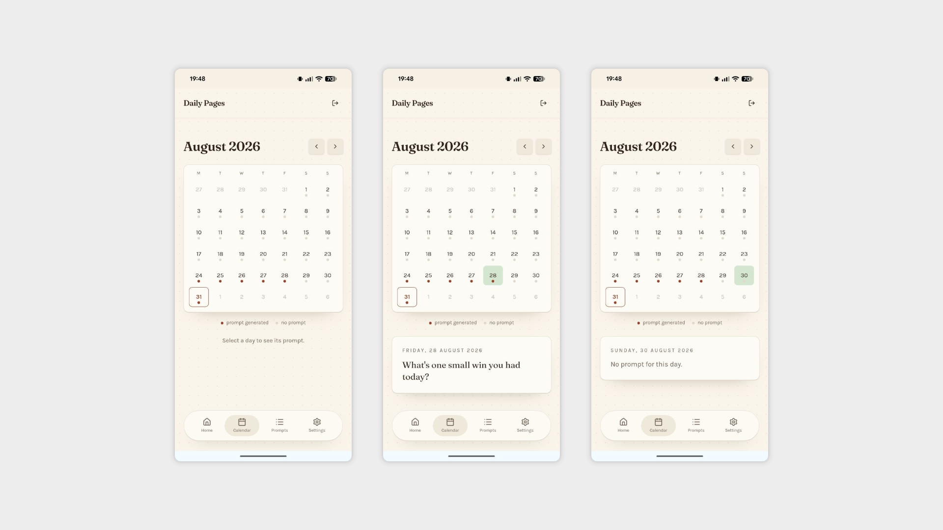
Calendar page with a selection of a day with and without a generated prompt
Day 5: Navigation and Prompts for Everyone
The two biggest changes of the week — one structural, one philosophical.
What I worked on:
Bottom navigation for mobile — Added a dedicated bottom nav bar for mobile devices, keeping the header clean and the most important actions always within thumb reach. The kind of thing that should have been there from the start, and now is.
User-managed prompts — Until now, adding prompts was an admin-only action. That felt unnecessarily restrictive for an app that's ultimately about personalisation. Users can now add their own prompts directly and activate or deactivate any prompt in the list at will. The app ships with a pre-loaded set, but the library is now fully owned by the person using it.
Opening up the prompt library changes the nature of the app in a small but meaningful way — it's no longer just a prompt generator, it's a personal one.
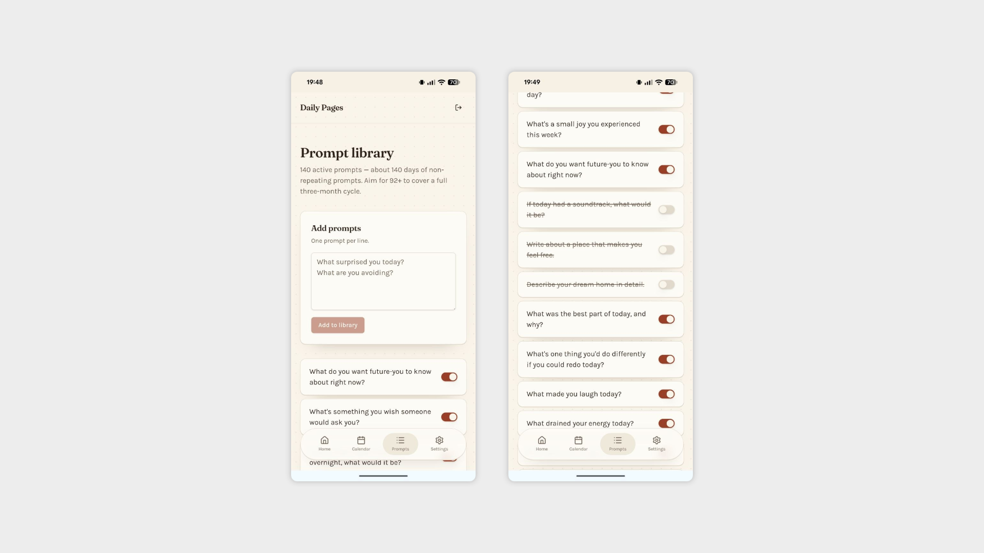
Prompt Admin page and add/remove function for prompts
Day 6: Small Fixes Before the Final Push
Not the last day of the project, but a good moment to close the loop on a few things that had been quietly annoying since the beginning.
What I worked on:
Favicon fix — The icon had been sitting inside a white border that looked out of place everywhere it appeared. Fixed, cleaned up, and now displaying correctly across all contexts.
Splash screen — The splash page is now working properly, displaying the app icon cleanly on both iOS and Android without the layout issues that had been lingering in the background for longer than they should have.
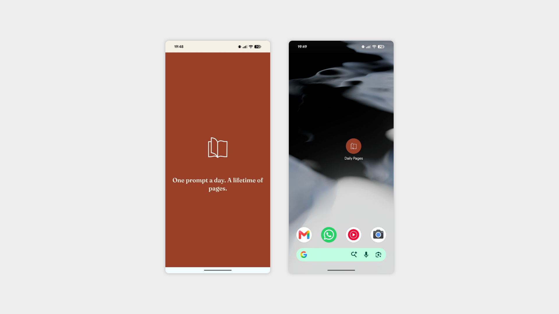
Splash page and favicon
