Packsense - Week 3
Days 10 and 11: Shared Trips Get Real and the UI Gets Smarter
A productive two days covering both a major feature milestone and a thorough round of usability improvements. The app is starting to feel like something you'd actually want to hand to a stranger and watch them use confidently.
What I worked on:
Shared trips:
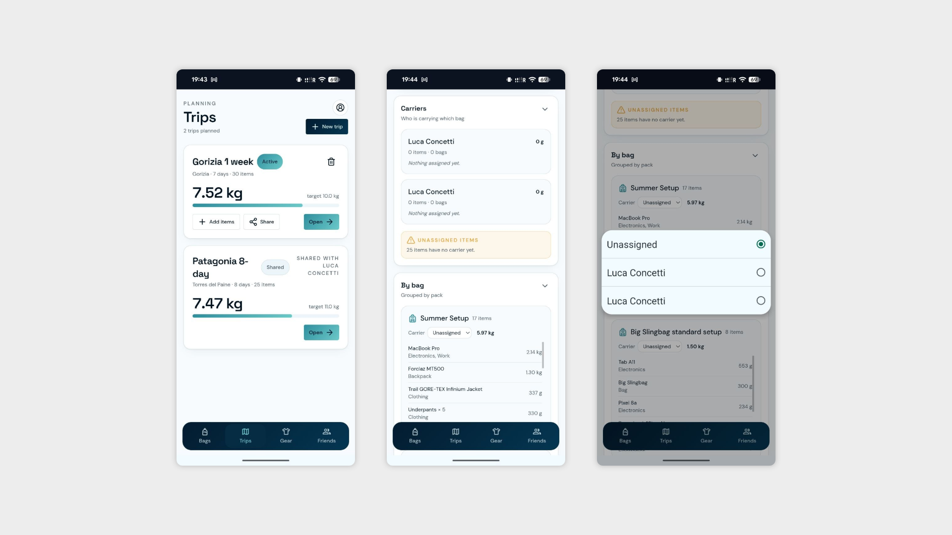
Unified trip page — Shared trips and normal trips now live on the same type of page. No separate logic, no inconsistent experience. The only difference is a clear indicator that a trip is shared with someone, keeping things simple without losing the context.
Collaborative packing list — Every participant in a shared trip can now add items to the bring list and assign gear to any participant in the group. The whole point of sharing a trip is building the perfect pack together — now the interface actually supports that.
Load distribution graph — A visual breakdown showing who is bringing what and how much weight each participant is carrying. Because nothing exposes an uneven packing split faster than a graph, and nothing starts a group chat debate faster than realising one person is carrying three times as much as everyone else.
Bag setups:
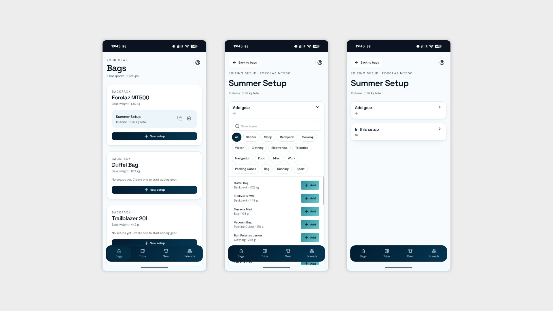
Cards with sub-pages — Bag setups are no longer displayed as expanded sections on the main page. They now appear as clean cards that open into a dedicated sub-page. The main page is dramatically shorter, and the cognitive load on what was becoming an overwhelming screen has dropped significantly.
General UI:
Font size consistency — A full pass to standardise typography across the product. The kind of thing users never notice when it's right and always notice when it's wrong.
Button and chip sizing — Adjusted for readability and tap comfort across screen sizes.
Mobile declutter — Reduced the number of visible elements on mobile to keep the experience focused. More breathing room, less noise, lower cognitive load.
Day 12: The First Real Interview
The first interview of the Packwise cycle is done. A shorter session than the Budgetzilla rounds, but with some sharp, focused feedback that points clearly in one direction: users want the app to do more of the thinking for them.
Interview #1
A user who understood the concept quickly and engaged with the core features without major navigation issues. The feedback wasn't about what was broken — it was about what could be smarter.
What they'd love to see:
AI-generated setups — Rather than manually building a bag setup from scratch, the app should be able to generate one automatically based on the trip type, duration, and destination. The gear library is already there — the next logical step is letting AI connect the dots.
Favourite gear protection — A way to mark specific items as favourites so the suggestion engine never recommends removing them. If someone always brings their Kindle or their favourite jacket regardless of what the algorithm thinks, that preference should be respected. The app should optimise around the non-negotiables, not against them.
Full trip planning via AI — The bigger ask: an internal AI tool that takes a destination, trip type, and number of days and assembles an entire trip from scratch — bags, setups, gear list and all. Less a feature request, more a vision for what the app could become.
The magic wand question:
All three requests today sat somewhere between near-future feature and magic wand — which is actually a good sign. It means the app's foundation is solid enough that users are already thinking about what comes next rather than flagging what's broken.
Day 13: When Your Friends Are Busy, AI Steps In
Coordinating interviews with real humans is, as previously established, the hardest part of any product process. With no willing volunteers available, I did the only reasonable thing: I asked Claude to roleplay as four different user personas and put the app through its paces. Unorthodox? Slightly. Useful? Surprisingly yes.
Four personas, four interviews, and a uncomfortable amount of consistent feedback.
What the mock interviews surfaced
What's working:
The Trips overview page lands immediately. Weight vs target at a glance, active and shared badges clearly visible. Every persona understood it without explanation.
The "Heaviest non-essential" panel on the trip page is a standout feature. The idea of being told directly what to cut and how much weight it saves resonated across almost every profile.
The Gear catalog feels solid. Sortable, filterable, brand and weight visible at a glance. Users who care about gear detail felt at home immediately.
The shared trip concept clicked for everyone who saw it. The "Shared with" label on the trip card communicated the feature without any explanation needed.
The weight target progress bar gave an at-a-glance status that multiple personas appreciated before even opening a trip.
What's not working:
The Bags and Setup onboarding curve — The biggest recurring theme across all four interviews. Users who don't naturally think in terms of named bag setups found the Bags section confusing or off-putting. The mental model requires explanation that the app currently doesn't provide.
Too much manual setup before the app becomes useful — The Gear catalog needs to be populated before trips make sense. For spontaneous or casual users, 45 items to enter manually before seeing any value is a real barrier.
The suggestion logic needs more context-awareness — Sport kit warnings appearing on work trips, clothing guidance expressed as ranges rather than concrete numbers, and the essential/optional star distinction not being clearly explained all surfaced as friction points.
No packing-day mode — Multiple personas wanted a simple checklist view to tick items off the night before departure. The app plans well but doesn't currently follow the user all the way to the door.
Family and multi-person assignment — Assigning gear to specific people within a shared trip wasn't obvious. Users expected to see who is carrying what, reflected clearly in the interface.
Mobile density — On smaller screens, the trip page stacks a lot of information vertically. Several personas felt it required too much scrolling before reaching the actual packing list.
The magic wand requests:
AI-generated trip and setup suggestions — let the app do the heavy lifting given what it already knows about the user's gear.
Pre-built templates for common trip types — a business travel starter pack, a weekend hike baseline — so users can trim down rather than build up.
Integration with external gear databases to skip manual data entry.
A family mode with per-person bag assignment and load distribution tracking.
The honest verdict
Claude is not a real user. It doesn't forget things, misread labels, or give up when something takes three taps too many. But it does pattern-match on UX principles well enough to flag structural issues that are worth paying attention to — and four consistent personas pointing at the same friction points is still a signal, even if the source is artificial.
The Bags onboarding curve and the manual gear entry barrier are the two things most worth solving before real interviews happen. Everything else is refinement.
Day 14: Fixing the Onboarding and Flirting with AI
The mock interviews from yesterday did their job. Two of the clearest problems — the onboarding curve and the lack of contextual explanation — got addressed today. A third, more ambitious problem also got started, and immediately ran into the most predictable wall in software development: money.
What I worked on:
Restructured tutorial — The onboarding flow has been split into two distinct phases, directly addressing the feedback that the Bags and Setup mental model was confusing new users:
Phase 1 (mandatory) — The essentials: add a piece of gear, create a new trip, and add gear to that trip. The minimum a user needs to get value from the app immediately.
Phase 2 (optional) — For users who want to go deeper: marking gear as a bag and building a bag setup. Available when they're ready, invisible when they're not. The app no longer assumes everyone thinks in terms of structured setups from minute one.
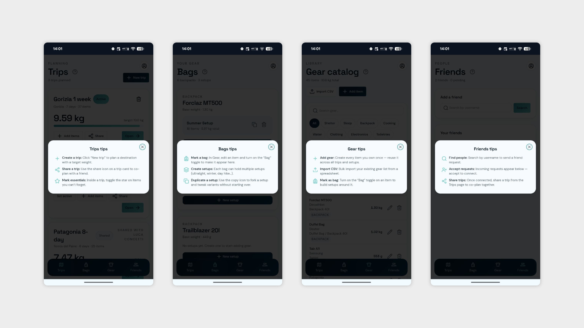
Info icons across all pages — Added a contextual info icon to every page, giving users a plain-language explanation of what that section is for and how it fits into the broader flow. A small addition that should meaningfully reduce the "wait, what is this page?" moments that kept coming up in the interviews.
Trip section previews — Added a visual showcase of the individual trip page sections, so users can see at a glance what kind of information is available inside a trip before diving in. A useful orientation layer that makes the trip page feel less overwhelming on first open.
AI companion — work in progress — Started building an AI feature that would suggest how to improve a pack and generate a gear list automatically based on what the user already owns. The concept is exactly what multiple interviews asked for. The reality, however, is that every AI model runs on credits — which means every user interaction has a cost. Keeping Packsense free for users while also not personally subsidising everyone's packing decisions indefinitely is a problem that doesn't have an obvious answer yet. The feature is started, the business logic is unresolved.
Single page informations
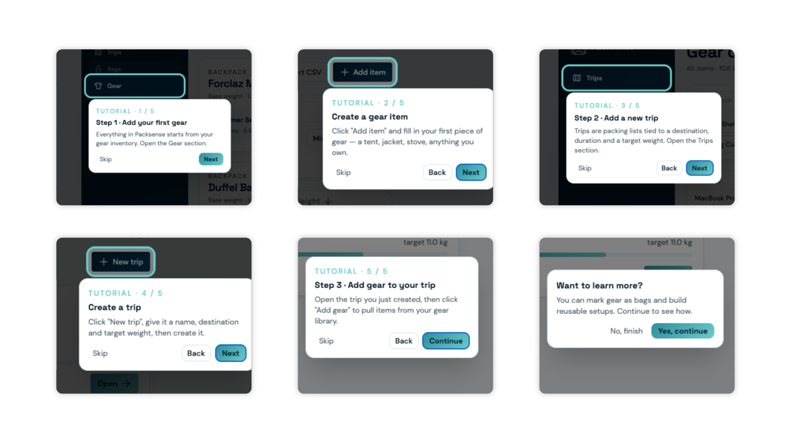
Tutorial/Support - First Part

Tutorial/Support - Second Part
Day 15: Lights Out
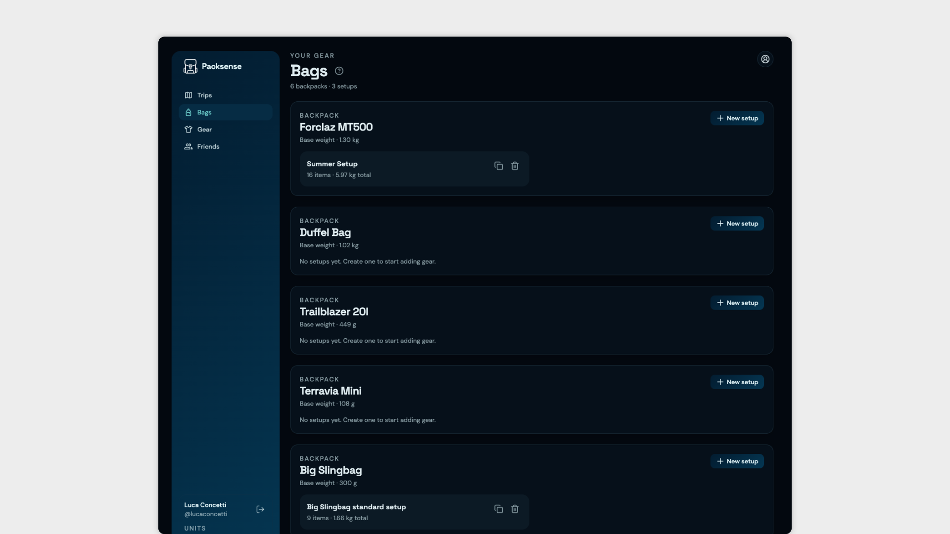
One interview request, three mock personas, and one very consistent piece of feedback later — the dark theme is live. Sometimes you just have to give the people what they want.
No onboarding restructures, no AI dilemmas, no existential questions about credits and sustainability. Just a clean dark mode implementation to close out the week on a satisfying note.
The app now works in both light and dark — which, at this point, is less a feature and more a baseline expectation. Better to have it done than keep apologising for it.