Packsense - Week 2
Day 6: Tidying Up the Gear Page
A focused start to the week. No sweeping new features — just a set of deliberate improvements to make an existing part of the app significantly more usable.
What I worked on:
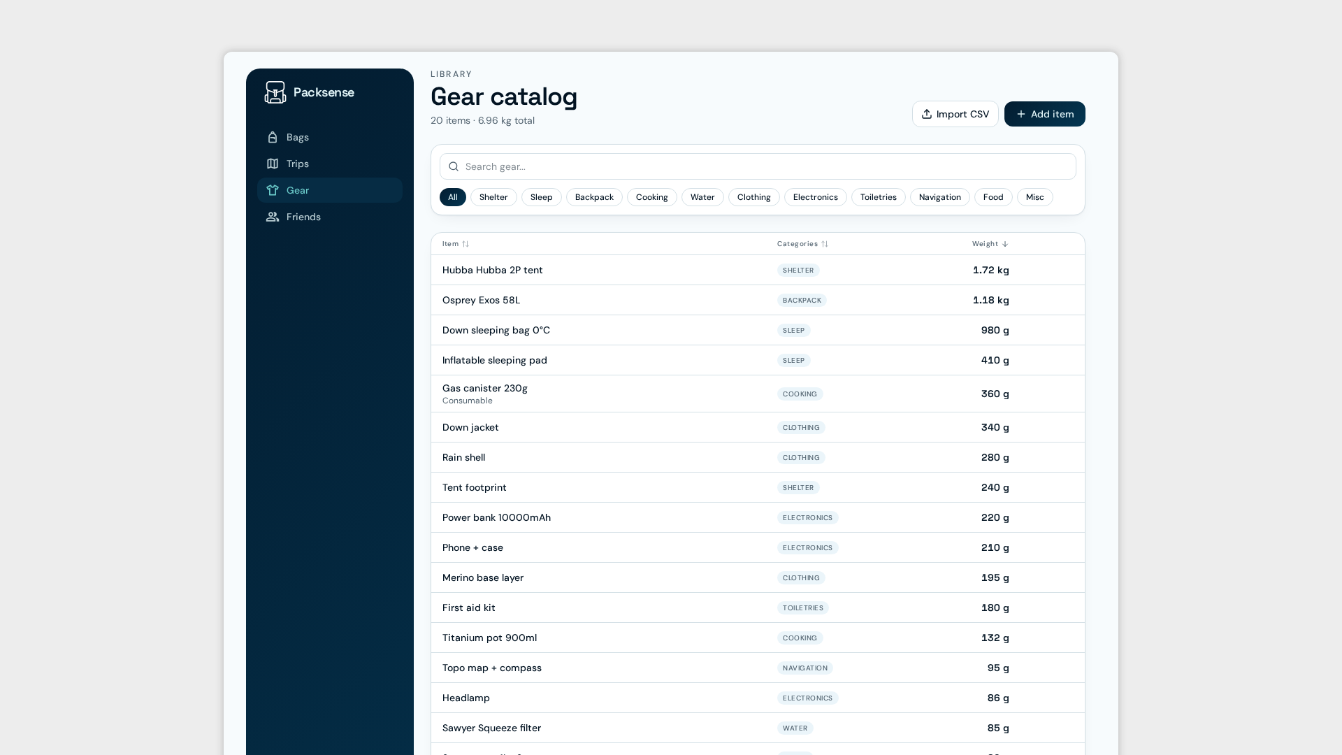
Sorting in the gear page — Users can now sort their gear by category, name, and weight. A small addition that makes a big difference once a packing list starts growing and finding anything becomes its own challenge.
Removed grid view — The gear page had a grid layout option that looked fine in theory and served no real purpose in practice. Removed without regret. A list of gear items is a list of gear items — it doesn't need to be a mood board.
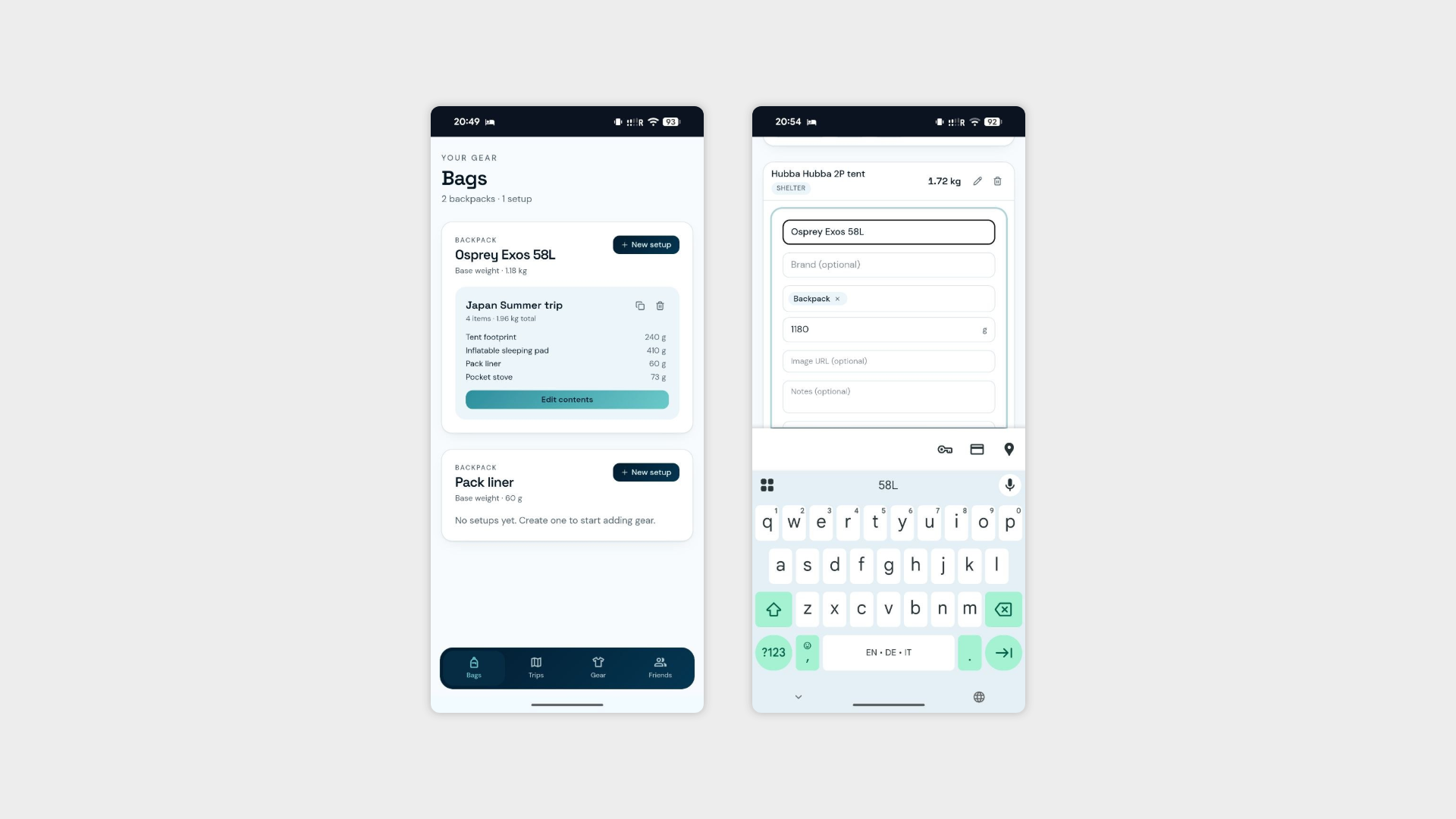
Brand field for gear items — Users can now associate a brand with each piece of gear. Useful for finding specific items quickly, keeping track of what you own, and — let's be honest — for the kind of person who needs to know exactly which brand of dry bag is at the bottom of their pack at all times. No judgement.
Layout adjustments — Minor refinements to the tablet and mobile layouts to keep things consistent and comfortable across screen sizes.
Day 7: Teaching the App to Think
Day 3 was less about building interfaces and more about building logic — the kind of work that doesn't look like much from the outside but is what separates a useful app from a smart one. The pack optimisation suggestions have been running on vibes until now. Time to give them some actual rules to work with.
What I worked on:
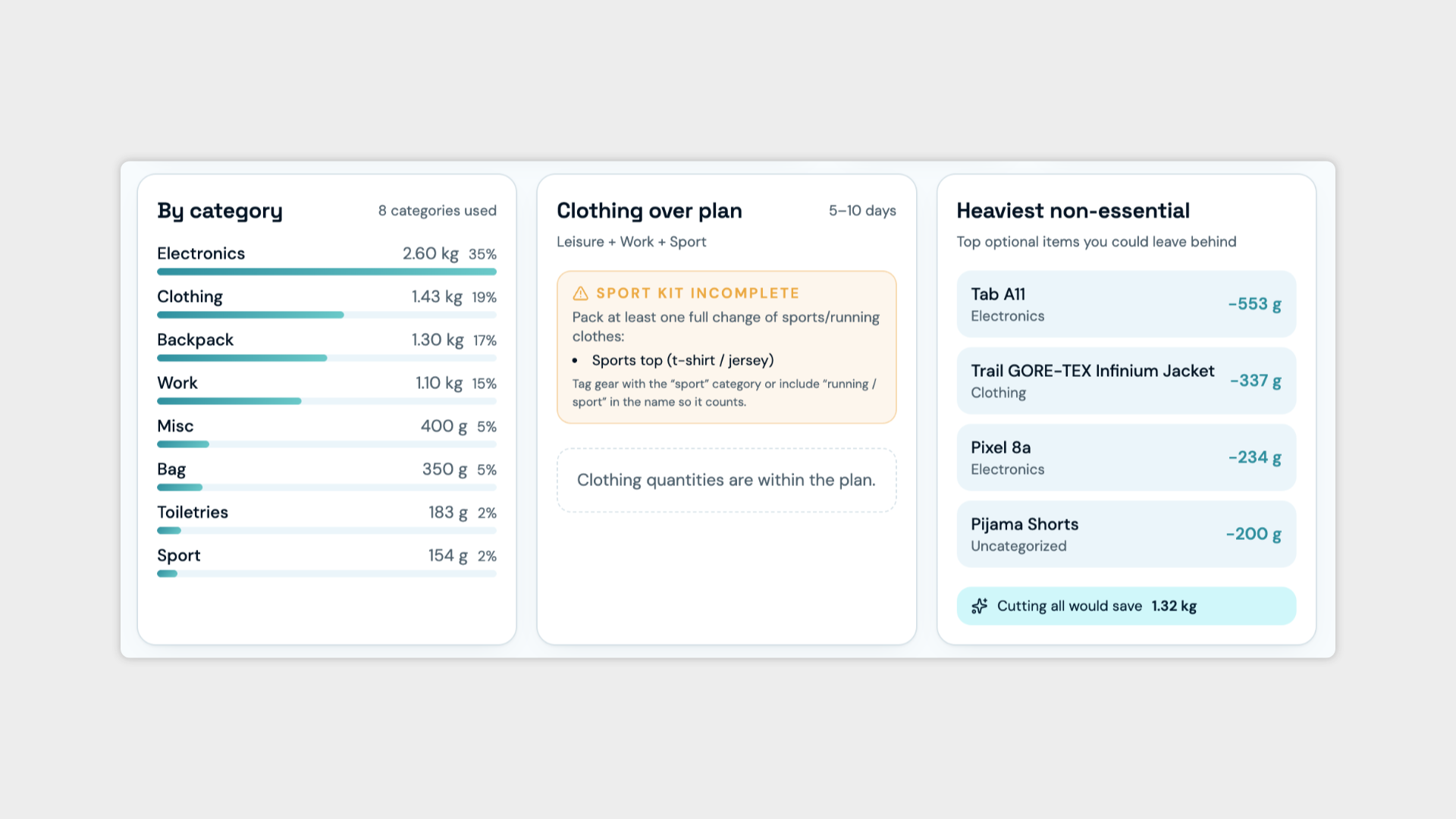
Clothing suggestions based on trip length — The first rule set: the app now calculates a suggested amount of clothing based on the number of days of travel. Simple, practical, and the foundation everything else sits on. Nobody needs seven t-shirts for a weekend trip.
Trip categories — Introduced a category system for trips, allowing users to define the nature of their travel:
Work — business trips, conferences, client visits.
Leisure — city breaks, holidays, general travel.
Sport — hiking, cycling, climbing and other activity-led trips.
Wedding — because weddings have their own entirely unique packing logic and deserve their own category.
And more, covering the full range of trip types a user might plan.
Category-specific suggestion rules — Each trip category now carries its own set of rules for what to suggest adding or removing from a pack. A work trip and a hiking trip have almost nothing in common from a packing perspective, and the app now knows that.
The suggestions are still far from perfect, but today they got considerably less stupid. Progress.
Day 8: More Rules, Better Suggestions
A quieter day building on top of yesterday's logic work — refining the suggestion system and making sure the experience holds up across devices.
What I worked on:
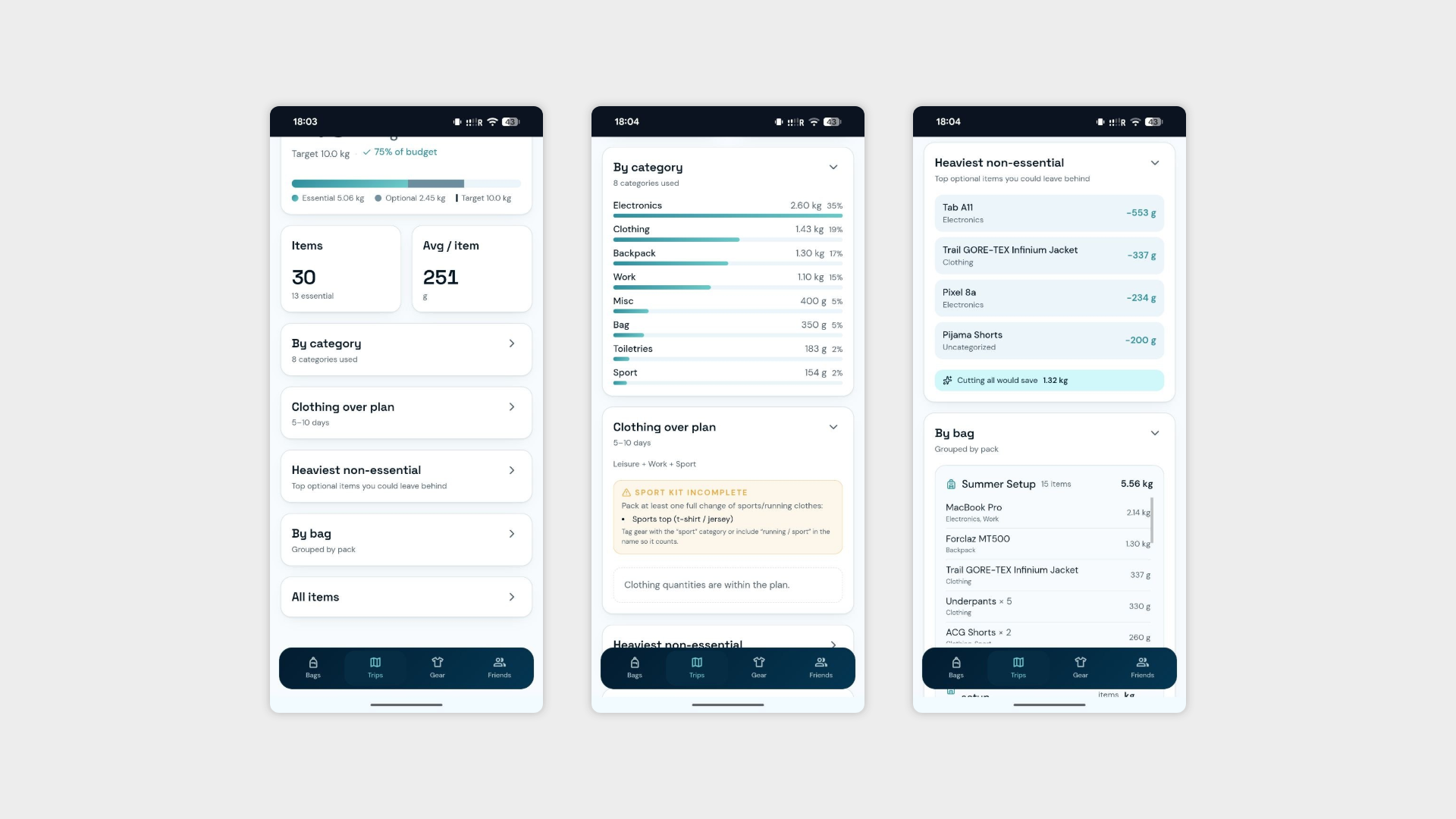
Multi-category trips — Yesterday introduced trip categories. Today made them more realistic. Trips rarely fit neatly into a single box — a hiking holiday is both sport and leisure, a work conference could end in a wedding. Users can now select multiple categories for a single trip, and the suggestion engine combines the relevant rules accordingly. A small change that makes the logic dramatically more useful in practice.
Tablet and mobile refinements — A round of targeted adjustments to keep the layout consistent and comfortable across screen sizes. The unglamorous work that makes everything else feel polished.
Day 9: Wrapping Up and Adjusting the Plan
The last day of the week, and an honest one. A session of smaller fixes, a realistic look at where the app stands, and a plan that bends to meet reality.
What I worked on:
Collapsible cards on the trip page — The trip page has been threatening to become an endless scroll for a while now. Gear items were capped last week, but the page itself was still getting unwieldy. Cards are now collapsible, letting users expand only what they actually want to look at and keep everything else tucked away. The page finally feels like something a human would want to use.
Mobile and tablet refinements — Another round of targeted adjustments across screen sizes. The kind of work that never fully ends but gets incrementally closer to done.
What's changing for next week:
The original plan was to move into interviews by Week 3. That's getting pushed. Turns out coordinating a group of friends for structured feedback sessions is significantly harder than building the app itself. Everyone is busy, schedules don't align.
Rather than waiting around, next week will be spent making better use of the time: continuing to improve the suggestion engine and tightening up the sharing functionality, so that when the interviews do happen, there's something genuinely worth putting in front of people.