Budgetzilla
Task:
Ideation, design, and development of a daily budget tracker web app, built as part of the Counterspell Challenge — a self-directed series of six apps, six weeks each, designed and shipped solo using Figma and Lovable.
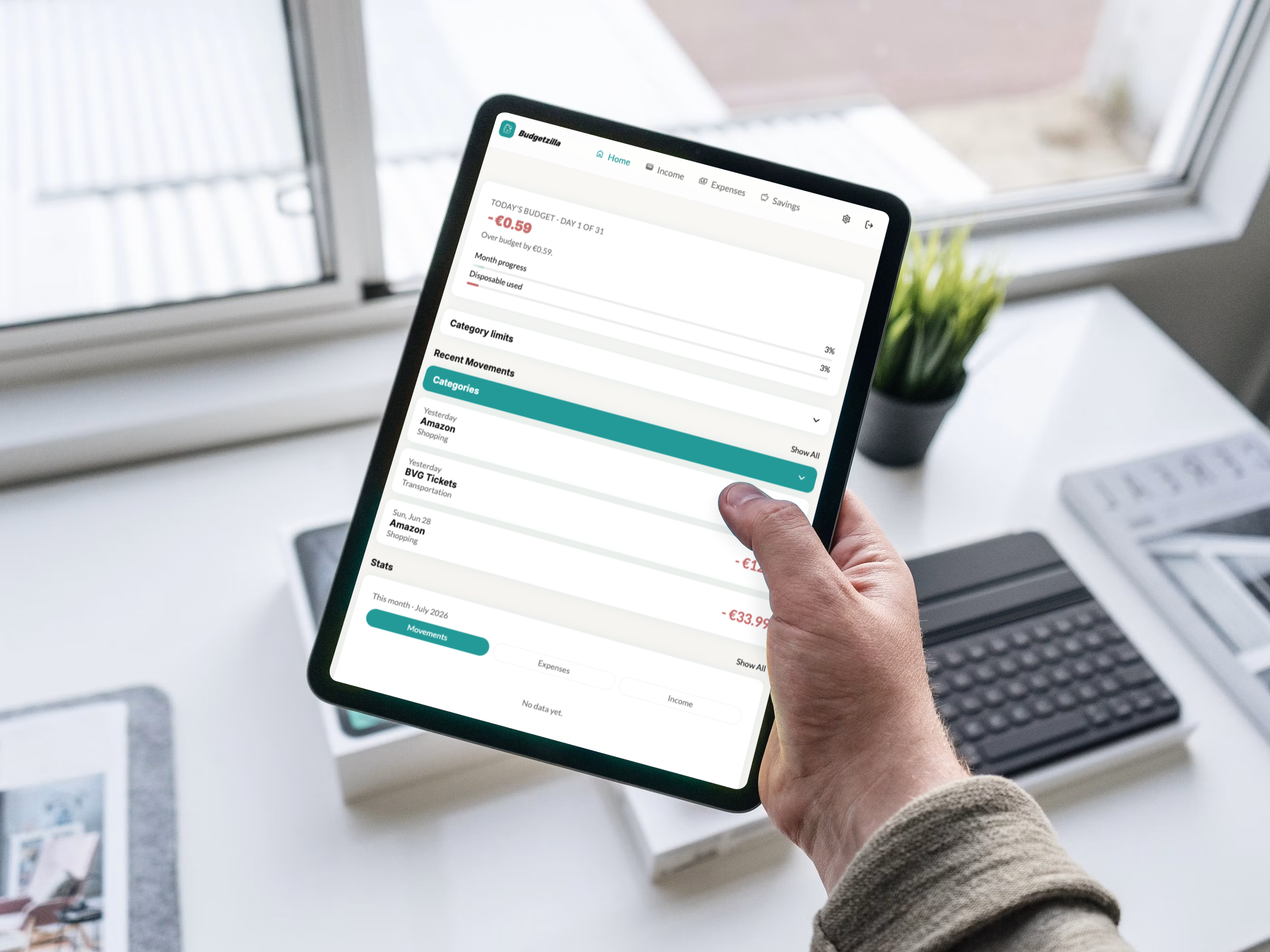
Built a daily budget tracker that reframes monthly money management around a simple daily allowance, automatically recalculating based on unspent days and recurring costs.
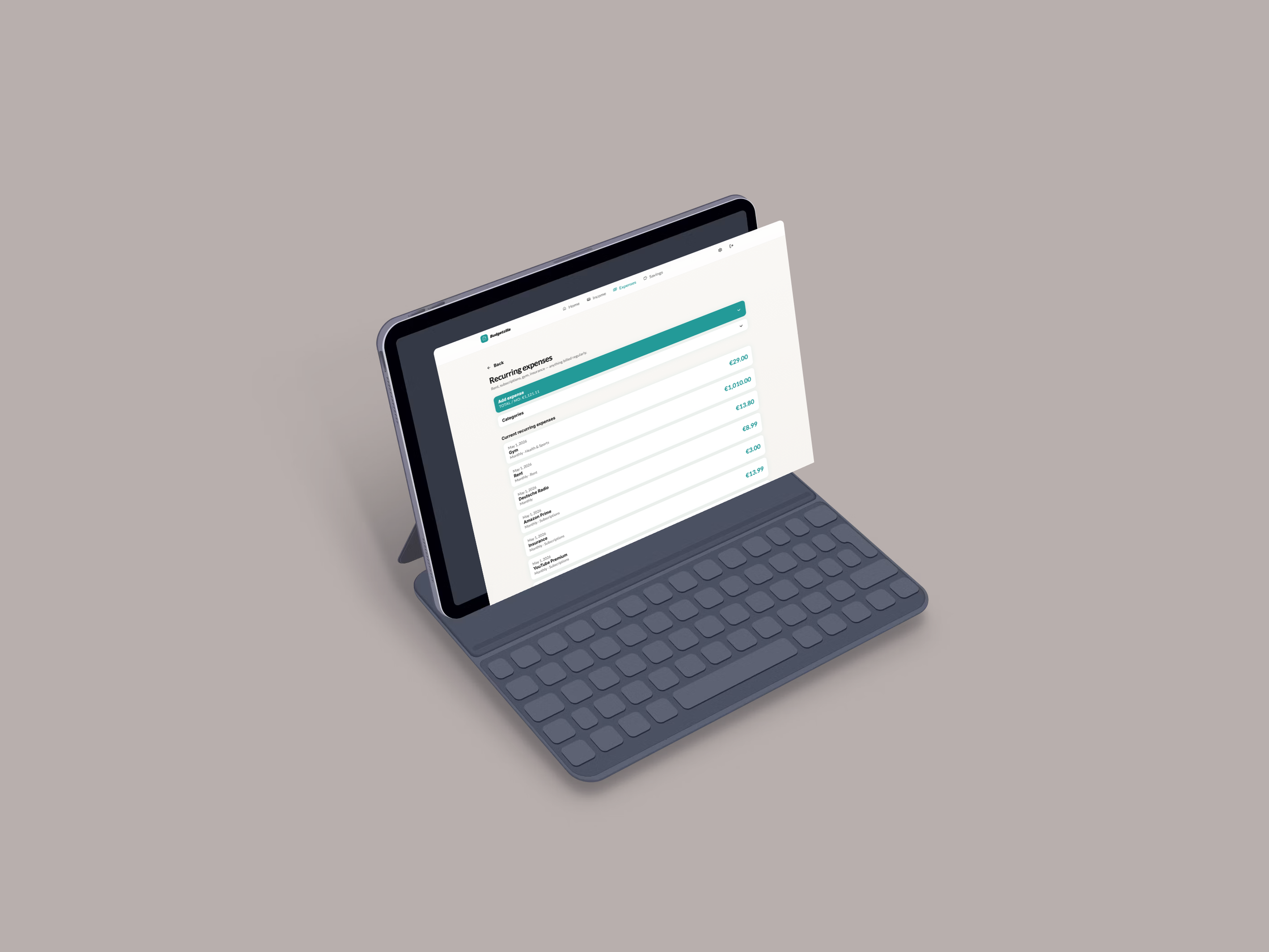
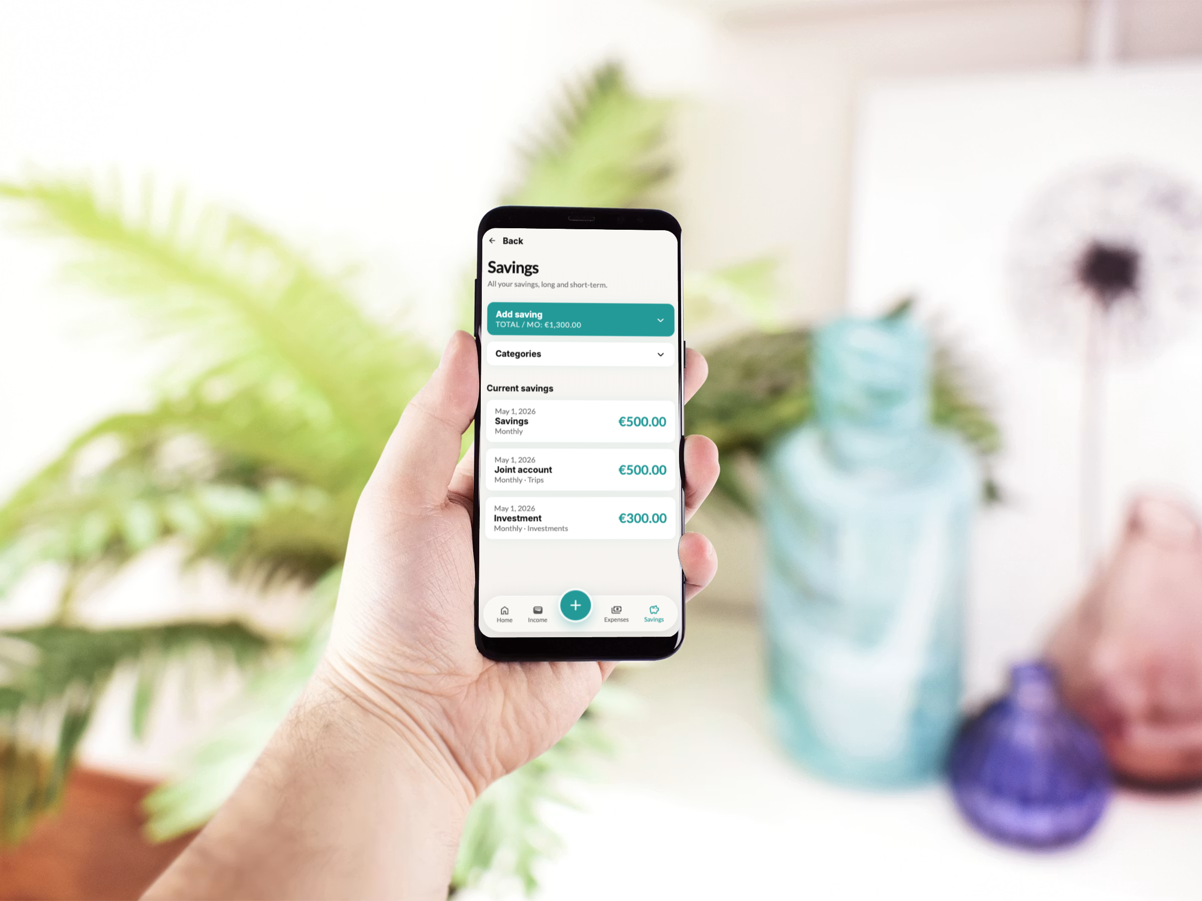
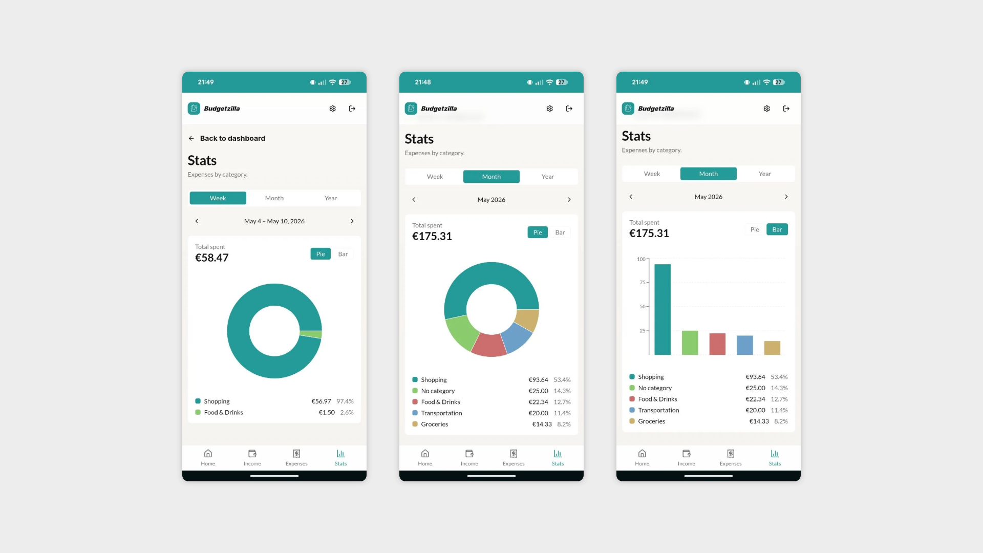
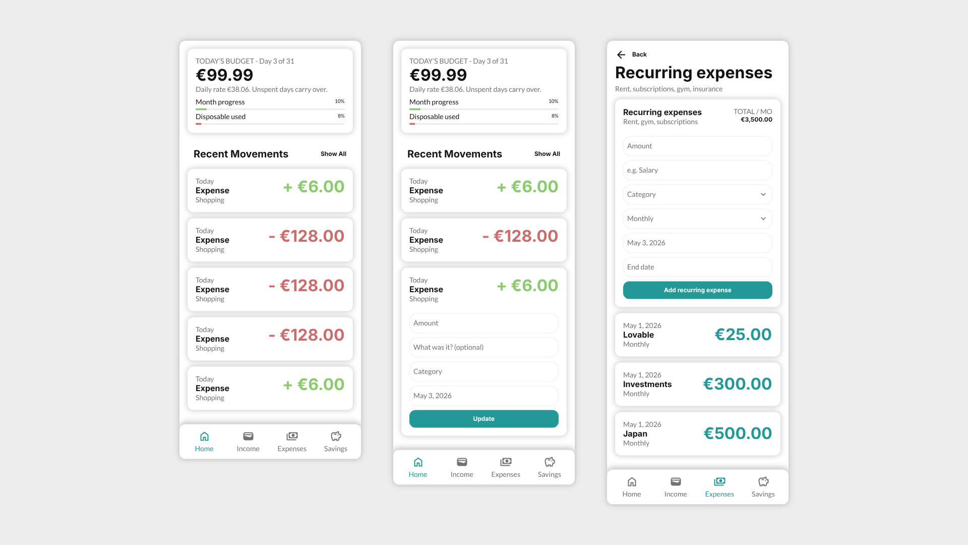
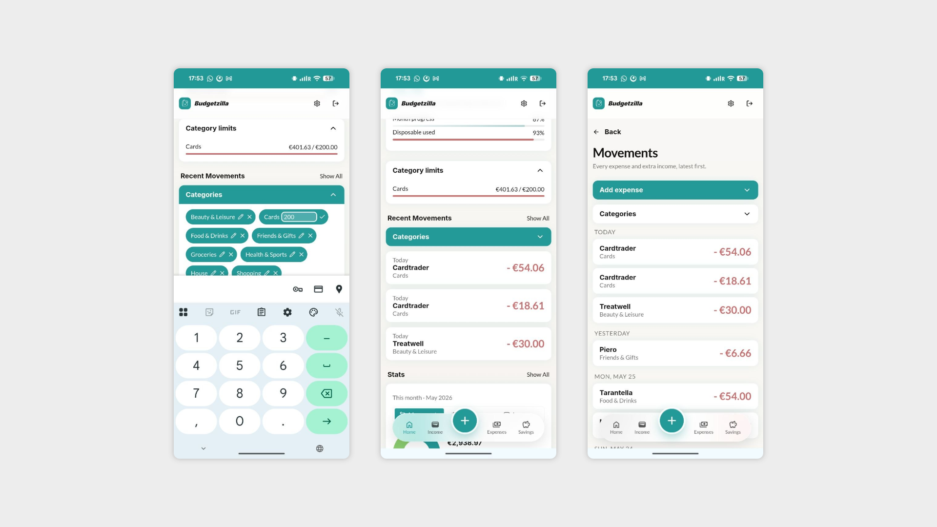
Launched with category-based spending limits shown as live progress bars, time-bound recurring expenses (for short loans, trials, and installments), and an automatic new-month rollover that carries unspent savings forward or offers a fresh start.
Conducted four user interviews after the initial build, which directly shaped a second development phase: inline category creation, a redesigned UI with dark mode, restructured navigation, and a two-phase onboarding flow.
Delivered as a fully functional, publicly accessible web app, tested end-to-end before moving on to the next app in the challenge.
Phase 1: User Needs
Before any interviews, the starting hypothesis was simple: most budget apps feel like spreadsheets, and spreadsheets make people feel bad about money. The first version of Budgetzilla was built around a daily allowance model — instead of "you have €1,200 left this month," the app tells you "you have €38 today," recalculated automatically as the month progresses.
To validate this, four interviews were conducted with people across different financial habits and tech comfort levels (Saya, Mimmo, Bull, Alberto). The findings were consistent: people wanted to log expenses fast, without detours to settings; they wanted to know before they overspent in a category, not after; and several wanted the app to understand that not all recurring costs are permanent — a loan, a trial, an installment plan all have an end date that most budget apps ignore.
Phase 2: How might we?
The proposed solution was a daily budget tracker that puts the most common action — logging an expense — front and center, while quietly handling the more complex stuff (categories, limits, recurring costs, rollovers) in the background until the user needs it.
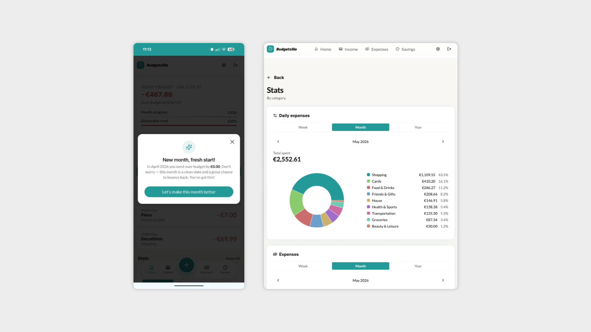
Rather than a dashboard full of charts, Budgetzilla leads with a single number: today's budget. Category limits appear as progress bars only when relevant. Recurring expenses can have a start and end date. And at the start of each month, the app checks in — did you save money last month? Carry it forward. Did you overspend? Here's a clean slate, no guilt trip.
Phase 3: Prototype
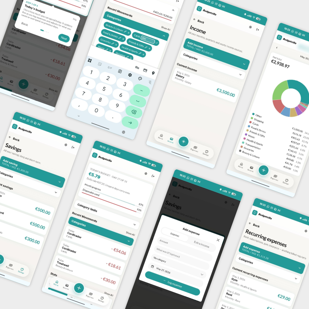
The first version was built in Lovable from Figma designs, focused on three core flows: adding income and expenses, viewing the daily budget, and managing recurring costs and savings. The interface was intentionally minimal — clear cards, large numbers, and a bottom navigation for the four main sections (Home, Income, Expenses, Savings).
This version was put in front of four users for real, unscripted testing — not guided walkthroughs, but genuine first-time use, including skipped tutorials and "where do I click" moments. The goal was to see where the design's assumptions broke against real behaviour.
Phase 4: User feedbacks
The interviews surfaced a pattern that wasn't fully anticipated: the friction wasn't in what the app could do, it was in how much effort it took to do it. Adding a category meant leaving the flow to go to settings. The interface looked functional but visually flat — more "internal tool" than "product." And the most-requested feature, category spending limits, only made sense once stats and the homepage were redesigned to support it.
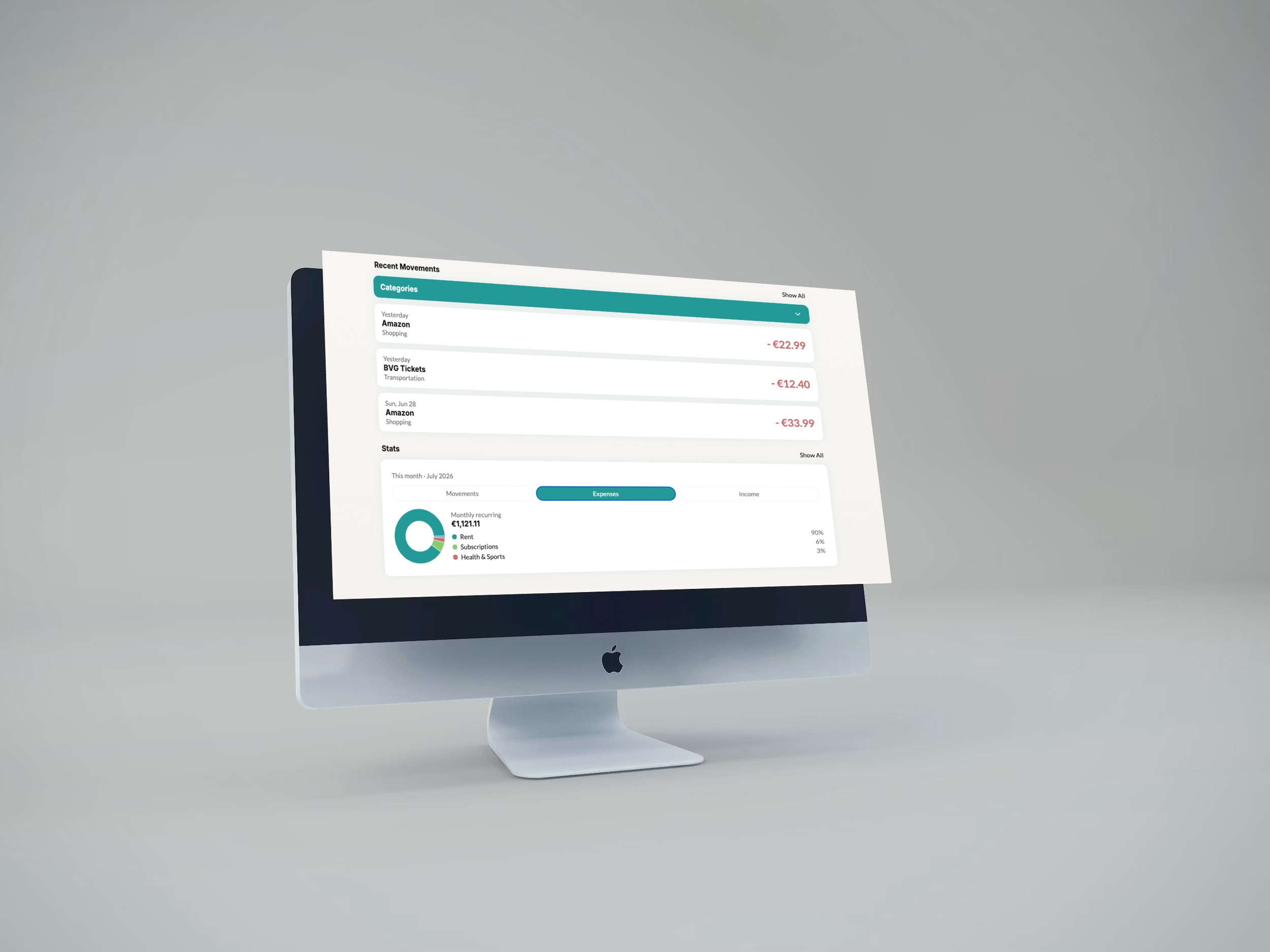
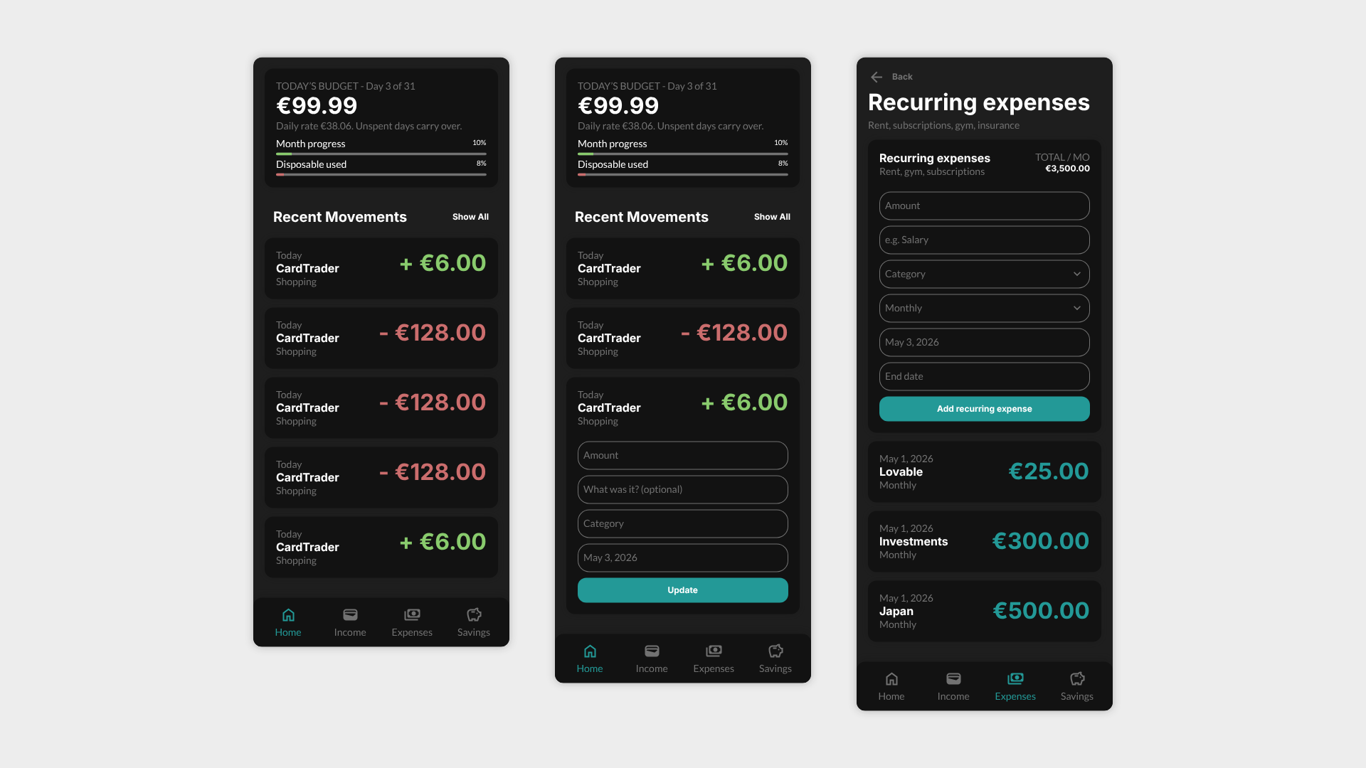
This triggered a second, larger development phase: a full UI redesign with dark mode (auto-adapting to device settings), collapsible forms to prioritize the data over the inputs, inline category creation from every relevant screen, a restructured stats page with independent cards for daily expenses, expenses, and income, and a two-phase onboarding (data setup, then a skippable guided tour).
The result: a product that went from "technically working" to "designed" — built, tested, redesigned, and re-tested within the original six-week window.
Phase 5: Second iteration
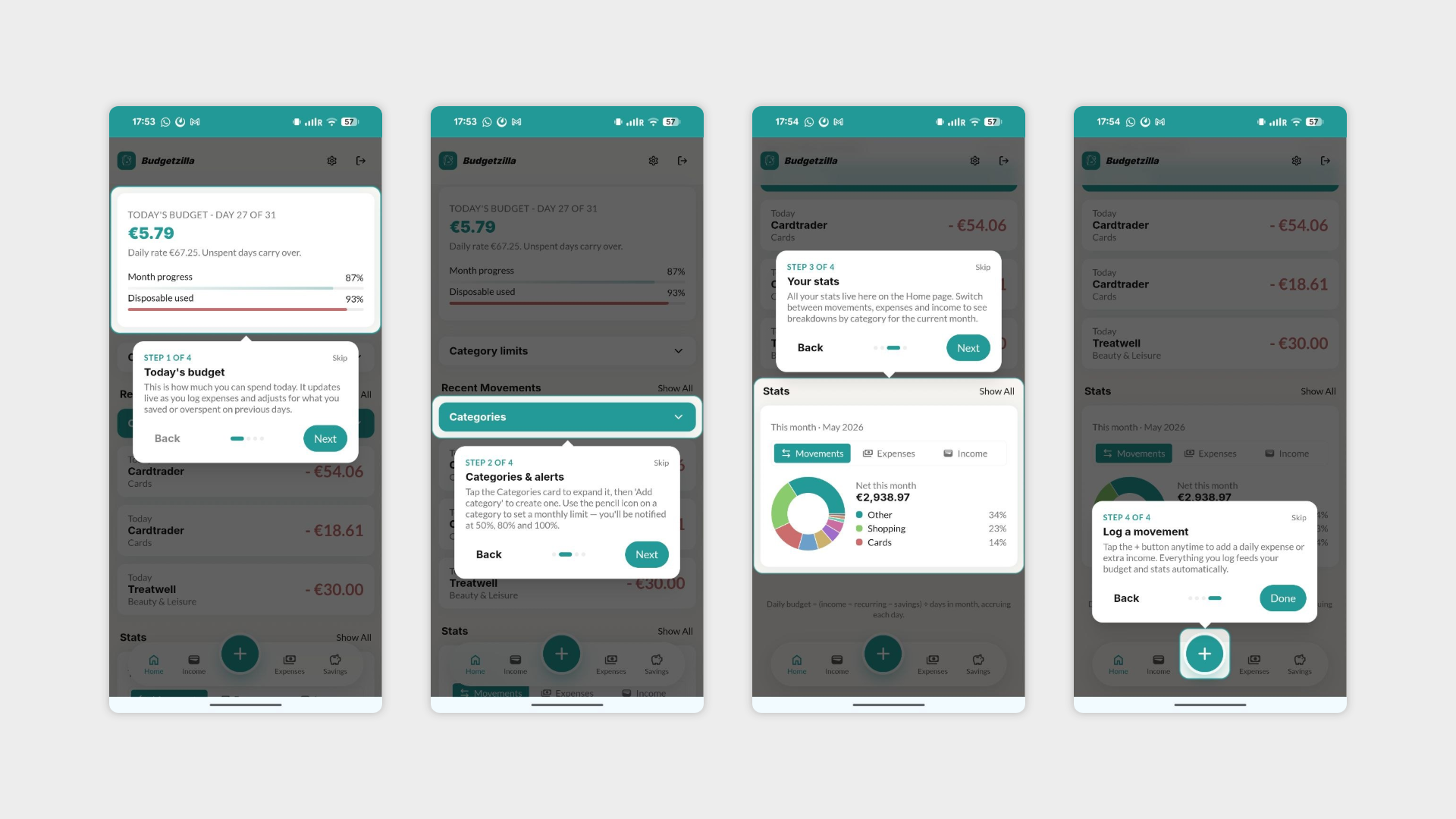
With the redesign live, the final stretch focused on the two most-requested features from the interviews: category spending limits with alerts, and a smarter integration between limits and stats. Rather than ship a basic "set a number, see a red bar" version, the limits feature was deliberately delayed by a week to design it alongside a restructured stats page — three independent cards for Daily expenses, Expenses, and Income, each with its own time selector and pagination.
This phase also closed out the remaining friction points from Phase 4: category creation became possible from every relevant screen (income, recurring expenses, savings, and the movement detail page), redundant settings were removed entirely, and the bottom navigation was redesigned to put "add expense" — the single most-used action — front and center.
The last addition was a new-month rollover flow: on the first visit of a new month, users with leftover savings are offered the choice to carry it forward as extra income, while users who overspent get a neutral "fresh start" message instead of a penalty screen.
Phase 6: Launch
After the second iteration was complete, the team spent a final day testing every section of the app end-to-end — checking that the new features (limits, rollover, restructured stats, inline category creation) worked correctly both individually and together, and fixing the inevitable issues that only appear once everything is connected.
Budgetzilla was then published as a live, publicly accessible web app, marking the completion of the first project in the Counterspell Challenge — six weeks from initial concept to a tested, shipped product, including a full mid-project redesign driven entirely by user feedback. Documentation of the process, including interview findings and daily build logs, was published alongside the launch.