Design Process
In this section I would like to show my approach to design. Starting from a task or goal set by a project manager or other stakeholder I would like to show you step by step my work process.
The project I am showing you here is from a design challenge I received during an interview in the past.
Explore the website on a mobile device and find a part that you feel can be improved, modified, or completely removed to improve the user experience.
Context: A savings-savvy person in France is looking to purchase a pair of Converse trainers and they’d like to save money on their purchase. They search for discount codes on Converse trainers on their mobile devices and come across this Radins link.
Jump to section
Observe
In order to be able to understand the main issues of the product my first step is to observe the main user flow and general user experience.
Identify
After observation I am then able to identify friction points whether they be UI or UX related.
Prioritize
After listing all friction points I identified it is time to prioritize them for the design phase.
Act
The design phase is the “hands on the field” part for which all the previous phases created a solid background.
Phase 1: Observe
This phase consists simply in getting awareness on how the the product is working and which are the main flows the user can follow.

Phase 2: Identify
After looking at the user flow and the screens I start to write a list of the most prominent friction points on which I want to focus my design/redesign phase.
I group them into two clusters: one for layout changes and one for missing features.
Layout
Font size too small (for older audience)
Labels/categories not clear
The main code is out of the reachable thumb area
Lack of consistency in 2nd navigation icons (burger/search)
Features
How can I find the best deals?
Can't copy the code directly from the first screen
Phase 3: Prioritize (Idea 2)
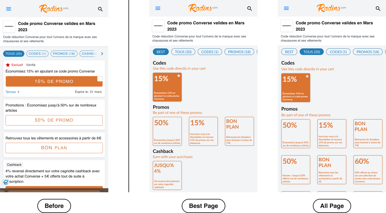
Selected feature: Have an additional tab in the top navigation to give users a clear view for the best deals.
Why prioritize this?
Decluttering of the landing screen from second level information
Reduction of the number of elements in the page to reduce the response time (Hick’s Law)

Phase 4: Act
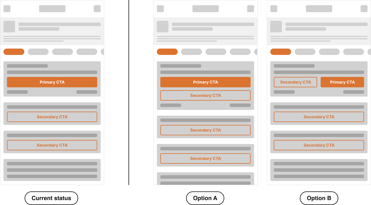
Initial Options
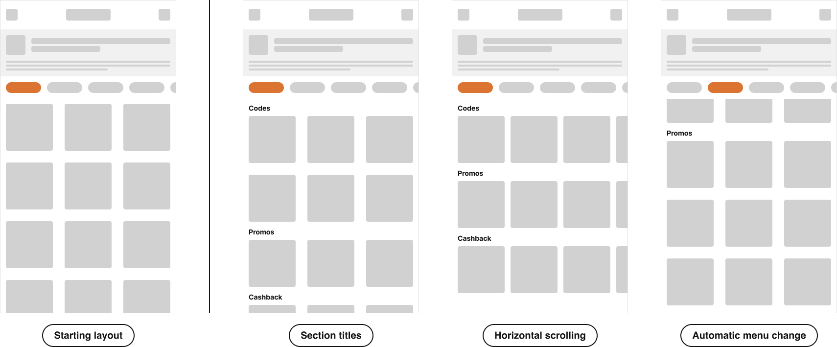
Iterations
The tiles layout has been iterated following the number of showed elements and their type of scrolling (horizontal, vertical, no scrolling).
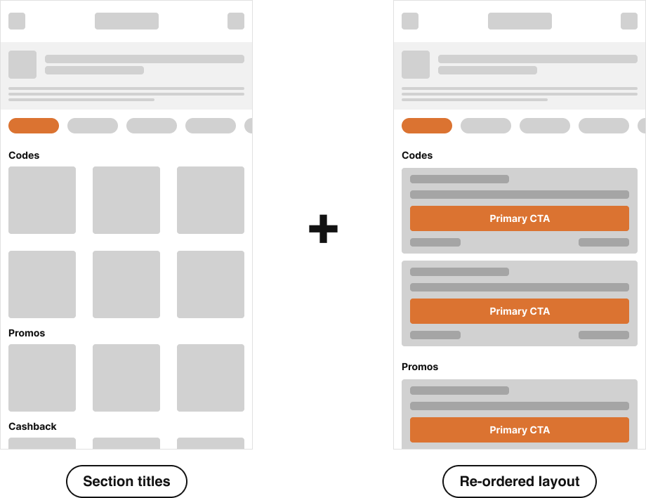
In addition to this I made another iteration combining the tiles and the list layout.
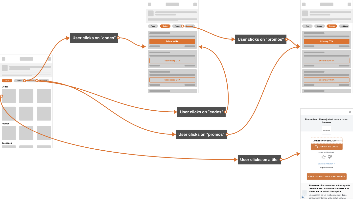
First Flow
Even with the tiles layout the problem of cluttered elements persists not giving the user a clear view on which are the best deals on the first viewport.
In fact, having more than 3 codes for each section will make the user scroll to search as before.
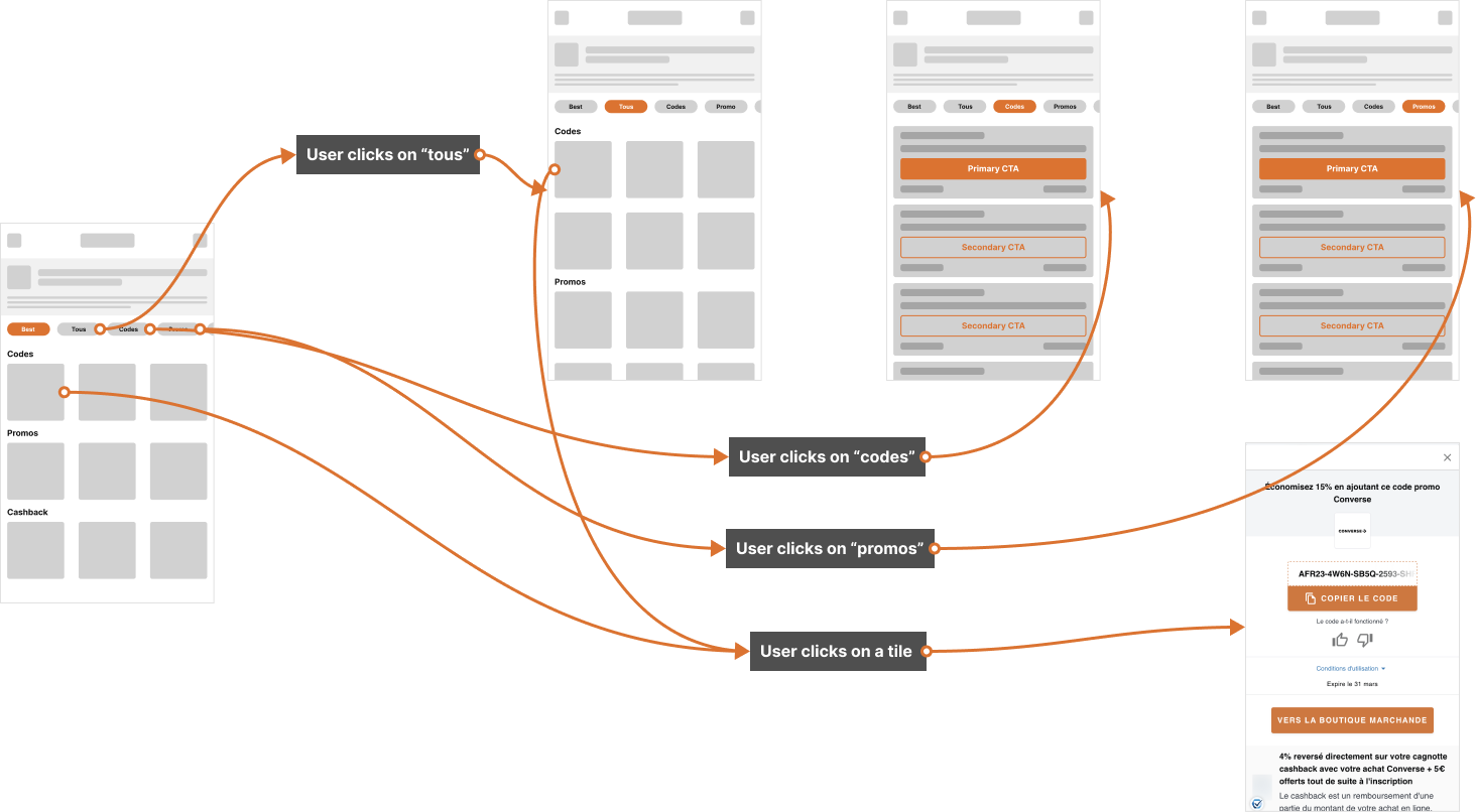
Second Flow
With an additional tile screen I’m able to show more results also in a filtered tab. This is solving the initial friction point.
Testing
To test the new layout of the page the success metrics I take in consideration are:
Success Rate for the number of copied codes
Time to Goal. The goal is find a specific code within the list
Bounce Rate
For the Success and Bounce Rate an A/B test could be conducted. For the Time to Goal test some user interviews could be conducted to check how much time users use to copy the code.