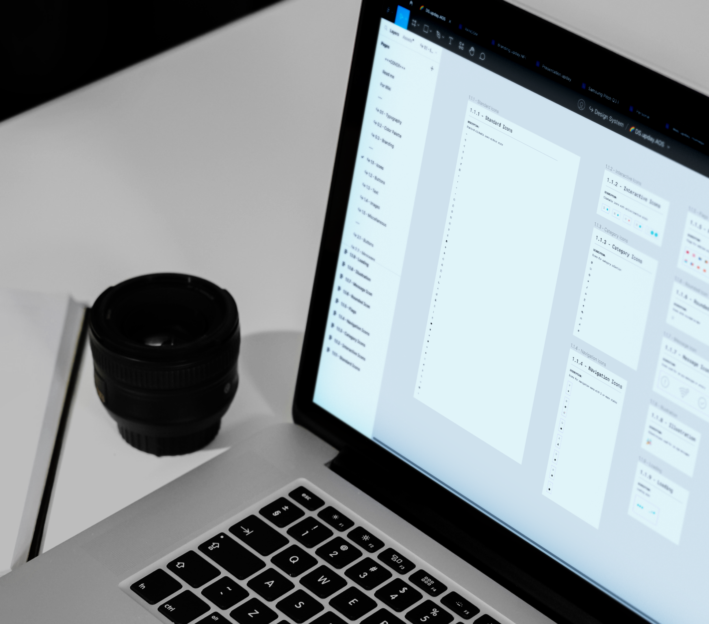
upday Design System
Implementation of a UI Kit and Design Tokens for a news aggregator app
Achieved Goals
Creation of a documented and shared UI Kit for the news app
Complete documentation and sharing with the development team ensure designers and developers have a unified reference.
Implementation of a UI Kit and Design Tokens for a news aggregator app
Project type: UI Kit and Documentation
Role: UI Designer
Collaborated with: Front-End Developers
Industry: News
Tools: Figma, Notion
Duration: 2022
Result: Documentation realised and shared with development team
Phase 1: User Needs
“How can we share our components easily to new-joiners in the design team?”
Luca, 27
“I need a place to get design components and guidelines which I can use as the only source of truth.”
Pulkit, 32
Phase 2: Research
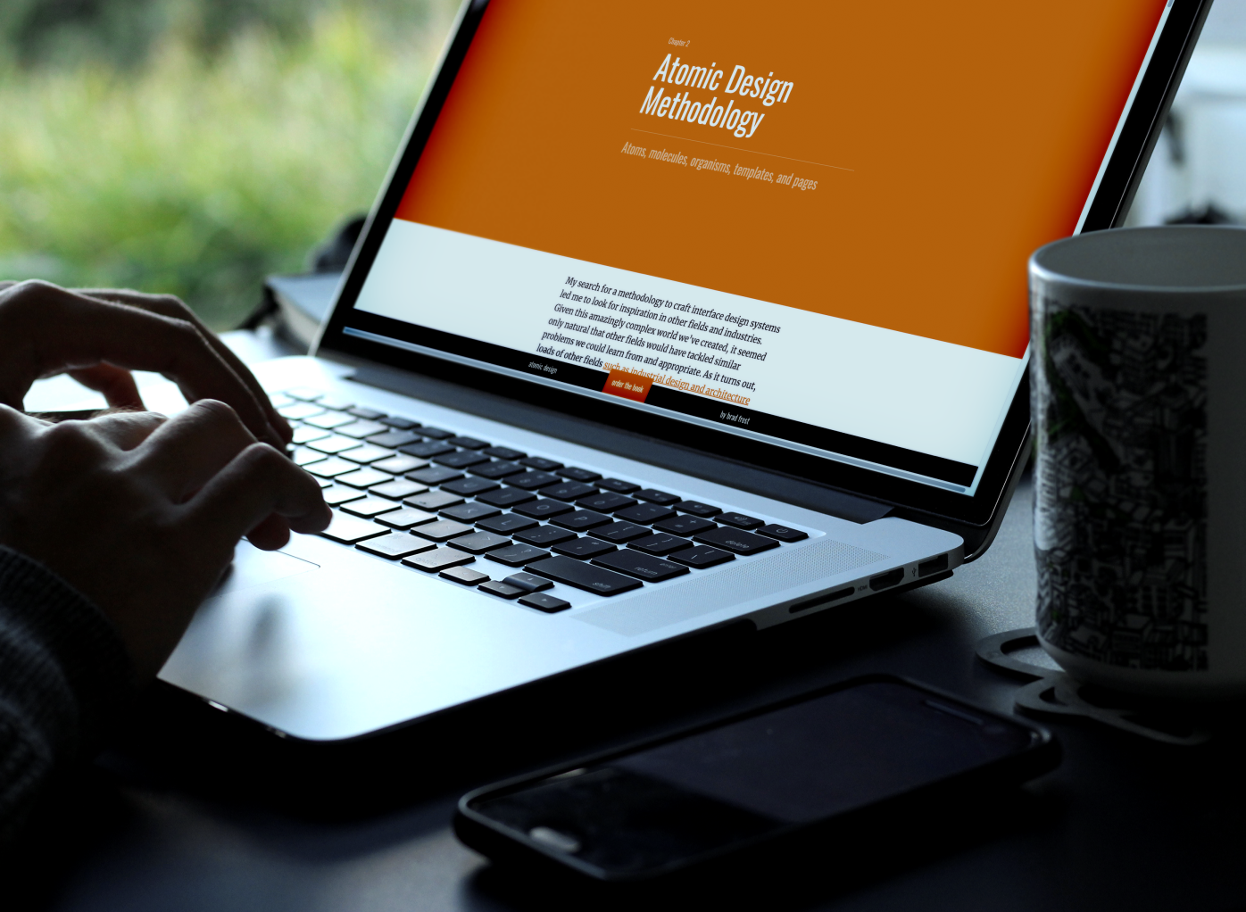
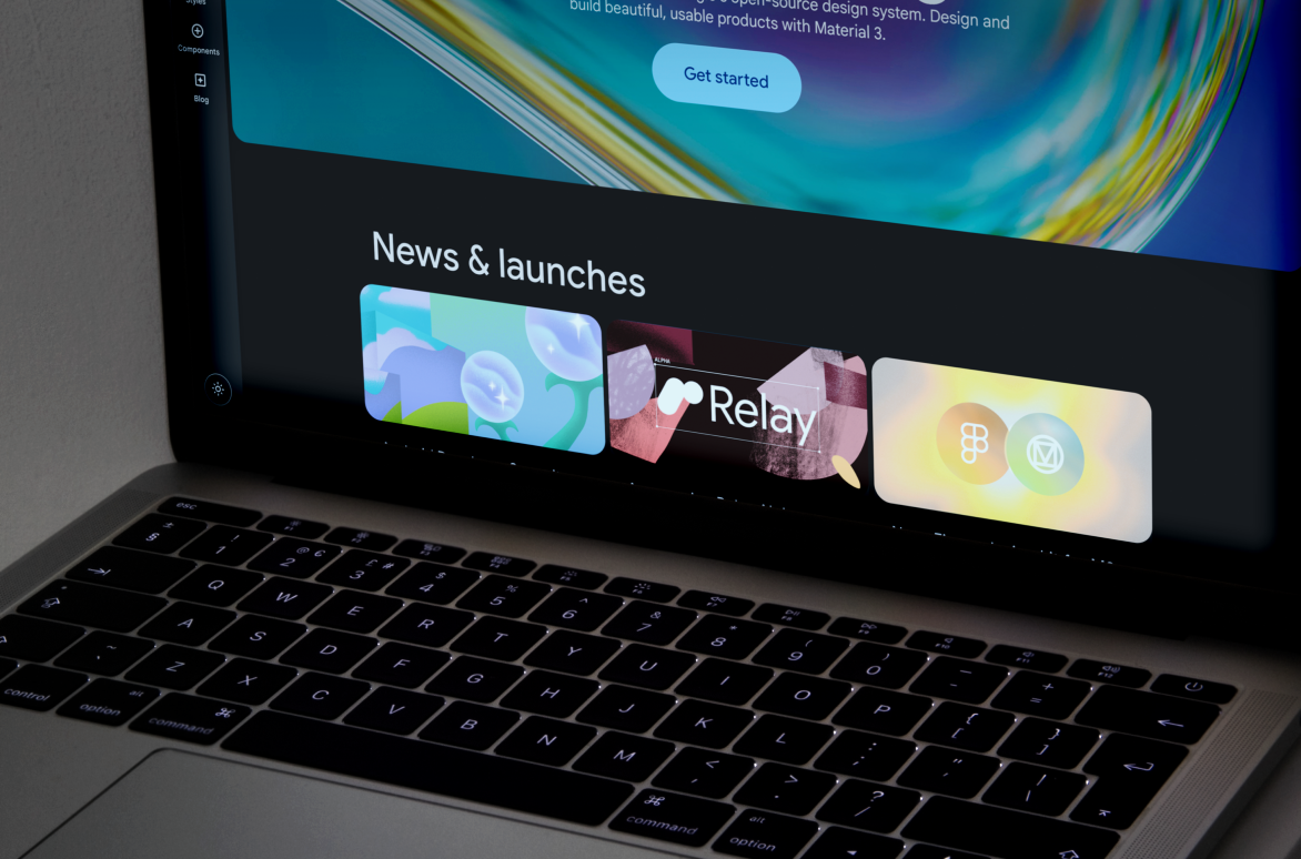
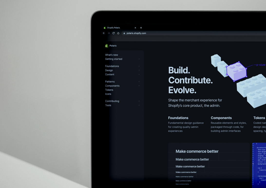
The project started with the research of already existing Design Systems to find which one was more suitable for the product.
After searching and studying DS like Material Design, Polaris, and Carbon the focused move more on a methodology to follow and the decision was made on the Atomic Design Methodology by Brad Frost.
This methodology allowed us to create a scalable and flexible design system with an easy access for editing which was the main request from all the stakeholders.
Phase 3: Action
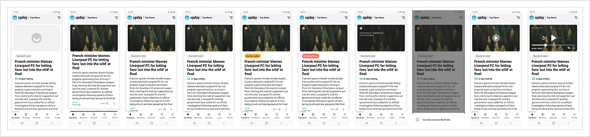
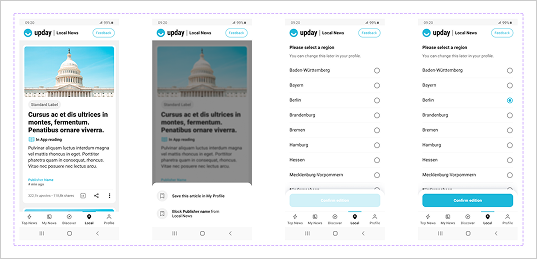
After defining the methodology to follow for creating the DS the next step was to build in this way a first section of it. We decided to move with the Top News section (the main section of the app) to have enough material to test afterwards and have a clear view if this method was performing or not.
So after defining the method and the section to focus the process started by creating first all the atoms, then the molecules, and so on related to that specific section until we arrived to the final UI.
During this process we did not focus on the definition of typography and colours for two reasons. They were already defined by the previous design and we wanted to focus only on the methodology of the Atomic Design methodology.
Phase 4: Testing
Once the first section was ready we moved on an internal test within all the involved departments.
After receiving a positive feedback from all of them, especially the FE department we agreed at unanimity to use this methodology entirely for our products.

Phase 5: Implementation
After the testing phase approved the Atomic Design Methodology I moved to redesign and reorganise the entire DS following this way.
I decided to move from a BIG to LOW scale. So starting from the already existing screens and divide them in smaller elements until I reached the atom element (i.e. the icon). This allowed me to have a clear view on which elements were recurring and which other were specific to some sections.
After gathering all these elements in clusters and archive them with specific names for an easier access the DS was ready to be documented and to be integrated with more general informations like colour palettes and typography.

After all the UI elements the DS moved on the documentation of the colour palette, both for light and dark mode and the typography.
For the combination of both the decision was to use only one primary colour for accessibility reason (i.e. colour blindness) and only one alert and secondary colour used only for special occasion.
The minimum level of contrast ratio between colour background and text accepted was the AA and the smallest body size was 12px just for captions. For body text the minimum was 14px to provide an always readable content.
Other projects

Jaxon
upday News
