Budgetzilla - Week 4
Day 17: Back at it.
Three things today:
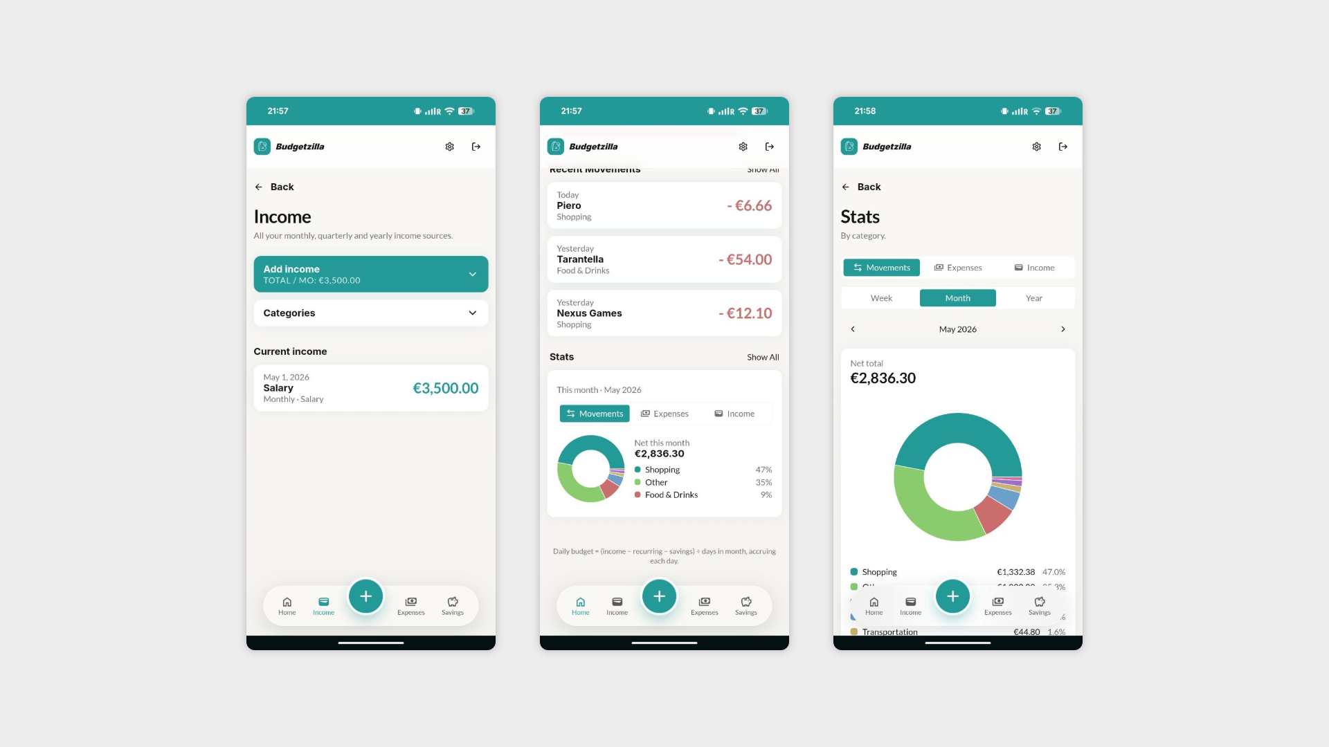
The bottom nav got a proper redesign, and the "add expense" button is now living right there. One of the interviews called this out: adding an expense should be the primary action of the app.
Stats finally make sense. They're now separated by what they're actually measuring: recurring expenses, movements, salary.
Onboarding got a pass too. New UI, new copy, updated to reflect how the app actually works now instead of how it worked three weeks ago.
Slow start to the week on paper. Less slow than it looks.
Day 18: The one where the last big feature finally landed.
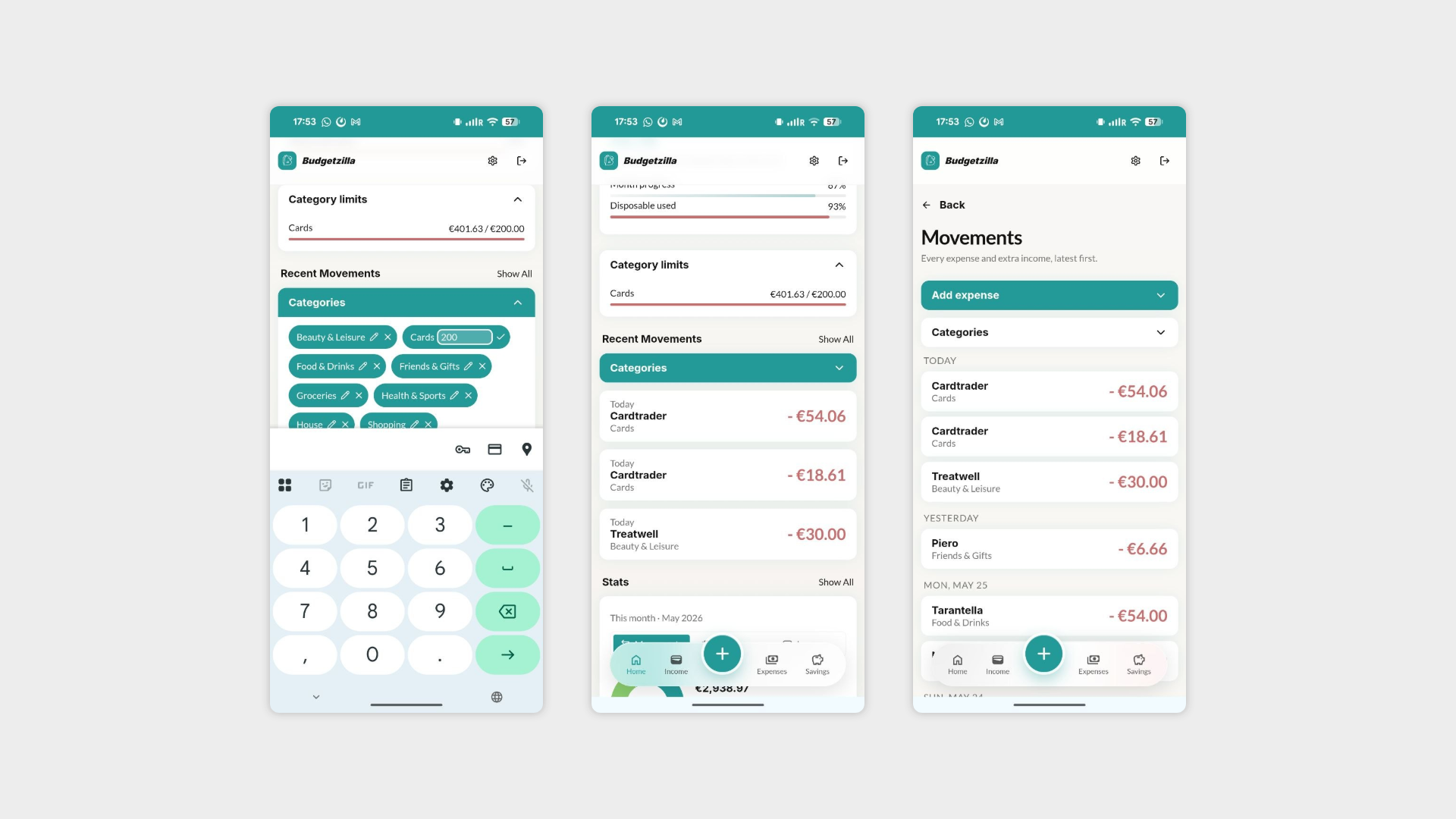
Category limits and alerts are in. You set a spending limit for any category, and the homepage now shows a progress bar for each one so you can see at a glance that you've burned through 80% of your "eating out" budget by day 12 and make your own decisions about that.
This was the most requested thing across all four user interviews. Took a while to get right because it only makes sense if the stats and the homepage work together. They do now.
Everything else that moved today was in service of that:
The homepage got restructured with fewer movements visible by default, more space for the category limits that are now actually doing something useful there.
You can now add categories directly from the movements detail page. That's the third place you can do it from, which means the "go to settings to add a category" problem is officially dead.
Speaking of settings now categories are gone from there entirely. They were redundant, confusing, and nobody was finding them anyway.
Day 19: Nobody reads tutorials. So I made two.
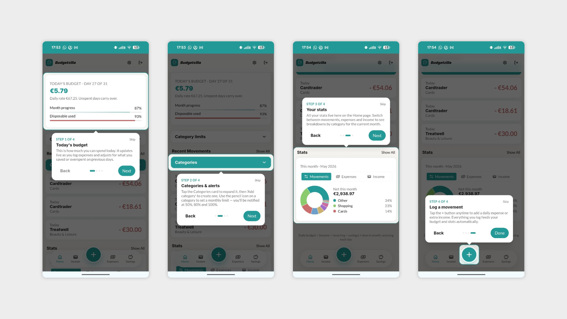
The onboarding is now split into two phases.
First: set up your baseline with income, recurring expenses, savings target. Skippable if you'd rather just dive in and figure it out yourself. You know who you are.
Second: a quick highlights tour that shows you where things actually live in the app. Also skippable, but fast enough that most people won't bother. Tooltips, highlights, done in under a minute.
One interview skipped the original tutorial on day one of testing and still managed to find everything eventually. The goal is that with this version, "eventually" becomes "immediately."
Day 20: The app now knows what month it is and has feelings about it.
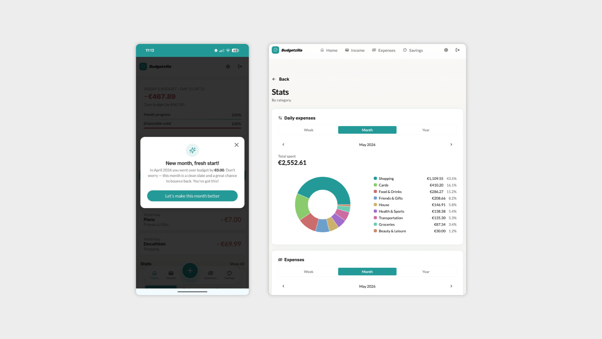
New month rollover is in. On your first visit of the month, if you saved money in the prior one, the app asks what you want to do with it: carry it over as extra income or start fresh. If you overspent, you don't get guilt-tripped. You just get a clean slate and a small nudge forward.
Stats got a proper architecture today. Three independent cards: Daily expenses, Expenses, Income. Each with its own week/month/year selector and date pagination.
Pie chart now sits beside the breakdown list on tablet and desktop instead of stacking vertically. Small thing. Correct thing.
Day 21: No new features. Just making sure everything actually works.
Spent the day going through every section of the app end to end.
Bugs found. Bugs fixed. A few things that worked in isolation but not together. The usual.
Week 4 is done.
Day 22: Budgetzilla is done. Shipped, tested, imperfect, and I'm moving on.
Could it be better? Absolutely. There are features I half-built, edge cases I know exist, and at least two things from the interviews still sitting in the backlog. But "done" in the context of the Counterspell Challenge doesn't mean perfect. It means real, live, tested, and learned from.
Six weeks or less per app. That's the rule. Staying on one thing until it's flawless is how this challenge turns into one app and a graveyard of good intentions.
What I'm taking into the next project: a better sense of how far Lovable can go before it needs hand-holding, a healthier respect for how long UI decisions actually take, and a list of interview findings that will quietly inform how I design the next thing.
